Choice overload
Choice overload is the tendency to delay, avoid or regret a decision when there are too many options to compare, especially when they are complex and people don't know what they want.
The famous evidence comes from a grocery store tasting booth. A display with 24 jams drew more shoppers (60% stopped) than one with 6 jams (40%), but only 3% of those who stopped at the large display bought jam, compared with 30% at the small one. Later research shows the effect is real but far from universal. A meta-analysis of 50 experiments found an average effect of virtually zero, with large differences between studies. A second meta-analysis found a reliable effect when four conditions apply: the options are complex, the decision task is difficult, people are unsure what they prefer, and they want to decide with little effort. When people already know what they want, a larger assortment can help them find it.
How to apply
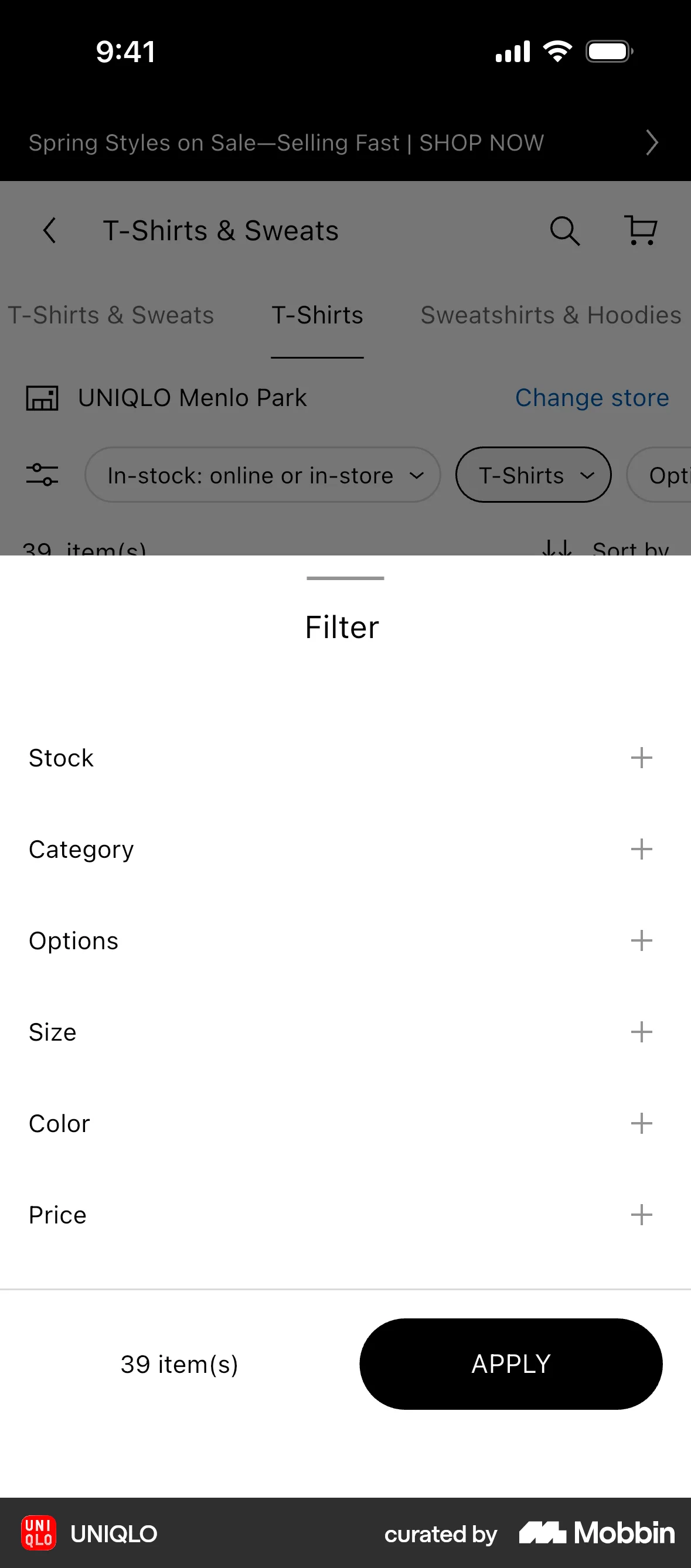
- Show fewer options at once when they are complex or users are new, for example three plans instead of six.
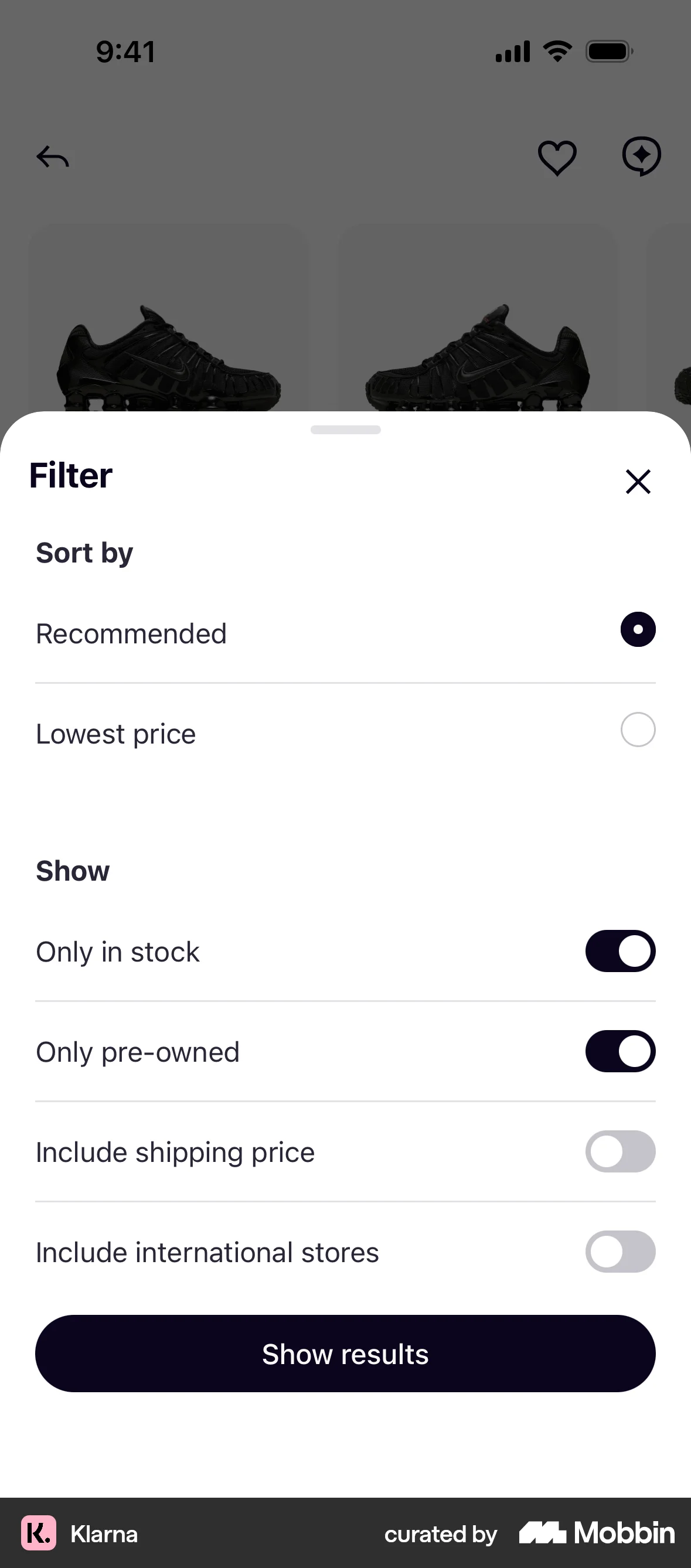
- Help people who don't know what they want with a recommended option, a short quiz or filters by use case.
- Make options easy to compare by listing the same attributes in the same order.
- Keep large catalogs for users with clear preferences, and give them search and filters to narrow them down quickly.
What to avoid
- Cutting options blindly. Removing what users came for can hurt more than a long list.
- Plan tables where every tier differs on a dozen features at once.
- Making users compare everything before they can continue, when a sensible default would do.
Real-world examples

References
- Iyengar & Lepper (2000). When Choice Is Demotivating: Can One Desire Too Much of a Good Thing? Journal of Personality and Social Psychology.
- Scheibehenne, Greifeneder & Todd (2010). Can There Ever Be Too Many Options? A Meta-Analytic Review of Choice Overload. Journal of Consumer Research.
- Chernev, Böckenholt & Goodman (2015). Choice Overload: A Conceptual Review and Meta-analysis. Journal of Consumer Psychology.
For agents
An agent-friendly guide to this principle lives at /agents/choice-overload.md.
Our MCP server and skills for all principles are coming soon.
Similar principles
Disclaimer: The theories here are just that — theories. They may not apply universally and should be considered in context. Use your own judgment and consult additional sources when applying these principles.