Aesthetic-usability effect
Beauty is read off a screen in a glance while ease of use has to be inferred, and the fast judgement colours the slow one. It is a rating effect at first contact, and it fades as people actually use the thing.
The founding result is a correlation between two rating scales, not a usability measurement. Kurosu and Kashimura had people rate 26 ATM layouts — same components, different arrangements — for how easy each looked and how beautiful it was: apparent usability correlated .589 with aesthetics, while the seven layout variables the designers held to determine inherent usability, such as key grouping and the position of the confirm and cancel keys, barely mattered, keypad type aside. Tractinsky replicated it three times in Hebrew, expecting a weaker correlation in a culture he describes as action-oriented rather than aesthetic, and got .832 to .921; the lower figure comes from the version that rated beauty and ease in separate randomised rounds to rule out response dependency. Two caveats travel with those numbers and are usually dropped: each is computed across the 26 designs on ratings averaged over participants, so none is the correlation between one person's two judgements, and nobody involved had used an ATM. Tractinsky himself wrote that it was “still premature to rule out the possibility of method variance as a major cause of the obtained results.” What the founding studies license is a claim about static screens: a layout that looks beautiful gets called easy before anyone touches it.
The study that put people in front of a working system is also the only one that found beauty masking a defect. Tractinsky, Katz and Ikar had 132 students run 11 tasks on a simulated ATM, with nine of the original layouts at three levels of rated beauty crossed with two levels of real usability. Perceived aesthetics and perceived ease of use correlated .66 before use and .71 after it. The usability manipulation worked on behaviour — 23.5 seconds per task in the high-usability condition against 37.5 in the low one — and never reached the ratings: post-use perceived usability moved with the aesthetics factor and not the usability factor, and in the high-aesthetics cells ratings were indifferent to whether the system had been crippled. Aesthetics did nothing for behaviour in return: no effect on completion time, none on the 1.26 errors participants averaged. The hole in it is that 9 of the 14 seconds separating the usability conditions were deliberate system delays, so much of what the beautiful interface absorbed was waiting rather than confusion.
Two later experiments that manipulated both variables found the arrow pointing the other way. Tuch, Roth, Hornbæk, Opwis and Bargas-Avila built four versions of an online shop and found no effect of aesthetics on perceived usability, while degraded usability lowered post-use ratings of beauty, with frustration as the proposed mediator. Hamborg, Hülsmann and Kaspar repeated that design on a mobile phone prototype with 88 participants: aesthetics did not affect perceived usability “either directly or indirectly,” and usability again moved perceived beauty. Hassenzahl's studies on MP3-player skins suggest why the literatures disagree: beauty rested largely on identification and stayed stable across use, while perceived usability became a strong determinant of overall goodness once people had used the skins. Which judgement leads depends on whether the interaction gave the user anything to be annoyed about, so a flow with a visible failure point has its looks marked down rather than its failure covered up.
The halo also has a shelf life. Sonderegger, Zbinden, Uebelbacher and Sauer followed 60 mobile-phone users across three sessions of a two-week field experiment, and the boost an attractive product gave to perceived usability “began to wane with increasing exposure time.” Their own recommendation is multiple-session usability tests, to keep that boost out of the ratings. The effect is largest in a single first session, which is the condition most design research is run under.
Whether beauty improves actual performance is a separate and weaker claim. Sonderegger and Sauer gave 60 adolescents two functionally identical simulated phones differing only in appearance: the appealing one was rated more usable, 6.13 against 5.19 on the PSSUQ, and was also operated better, 147.7 seconds per task against 198.5 and 2.0 errors per trial against 4.8 — though the authors concede the unattractive prototype may simply have looked unfamiliar. Moshagen, Musch and Göritz ran 257 volunteers through search tasks on four versions of a health website and found an interaction rather than a main effect: high aesthetics sped up completion only where usability was poor. Thielsch, Haines and Flacke gave 331 participants an aesthetic or unaesthetic version of one site (VisAWI 4.46 against 3.13, g = 1.27) and found no effect on accuracy or response time in search, creative or transfer tasks — while the usability ratings, which they never manipulated, still came out higher on the attractive version (5.25 against 4.59, g = 0.53). Schlamann, Nestler and Thielsch's preregistered meta-analysis of 31 studies and 18,794 participants pools the performance effect at g = 0.29, with high unexplained heterogeneity, interaction device and typography manipulation as the moderators, and a sign that studies defining their aesthetic conditions after the fact were confounded by prior user experience.
What the surface reliably does is get judged fast, and carry credibility while it does. Lindgaard, Fernandes, Dudek and Brown showed homepages for 500 ms and then for 50 ms, and appeal ratings were highly correlated across the two exposures: half a glance is enough. Reinecke and colleagues had 548 volunteers rate 450 websites, and their models of perceived colourfulness and visual complexity, plus age and education, account for about half the variance in appeal after a 500 ms viewing. Fogg and colleagues had 2,684 people comment on the credibility of live sites and found “design look” raised in 46.1% of comments, ahead of information structure and information focus. Beauty is the faster of the two judgements too: in Tractinsky's timings it took 7.58 seconds against 8.68 for ease of use. So the defensible version is narrow. Visual quality decides the first impression and inflates what people say about ease of use at first contact; that inflation shrinks with exposure, vanishes in some well-powered experiments, and has never shown up in completion times or error rates. Polish earns you the first session; the ratings it produces are not evidence that the flow works.
When it holds
- At first contact, before use. The famous correlations — .589 in Japan, .832 to .921 in Israel — are a priori judgements of static layouts, each projected for about 15 to 20 seconds; measured on people who had actually used the system, the correlation was .66 before use and .71 after.
- In what people say, not in what they do. In the ATM experiment the aesthetics factor moved post-use perceived usability while the usability factor did not, and aesthetics moved neither completion time nor errors.
- In single-session tests. Across a two-week field experiment with three sessions, the boost an attractive product gave to perceived usability began to wane with exposure, which is why its authors recommend multiple-session tests.
- When the interaction gives nothing to be annoyed about. Two experiments that manipulated usability as well as beauty — an online shop, and a phone prototype with 88 participants — found no effect of aesthetics on perceived usability, and instead found poor usability lowering ratings of beauty.
- Not reliably in performance. The pooled effect of aesthetics on performance is g = 0.29 across 31 studies and 18,794 participants, with high unexplained heterogeneity; a 331-participant web experiment with a strong manipulation (g = 1.27) found nothing on accuracy or time.
- Where performance does move, it is compensatory. Across 257 volunteers and four versions of a health website, high aesthetics sped up task completion only in the poor-usability versions — an interaction, not a main effect.
- Masking rests on one study and one condition. Only the high-aesthetics cells of the 2000 ATM experiment failed to register the usability manipulation, and 9 of the 14 seconds per task that separated the usability conditions were deliberate system delays.
- Attractiveness is partly familiarity. The unappealing phone prototype may have read as unusual rather than ugly, and the meta-analysis flags prior user experience as a confound in studies that labelled their conditions after the fact.
How to apply
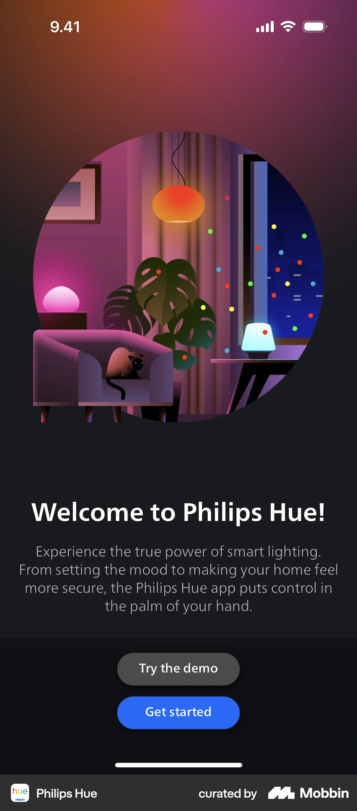
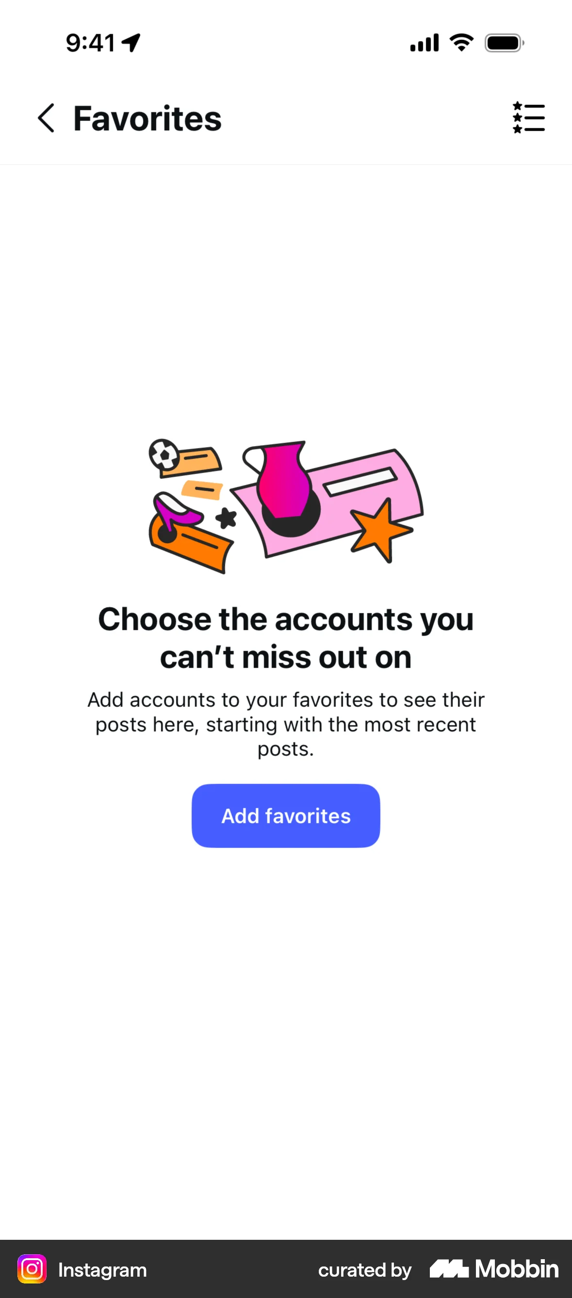
- Spend the polish budget on the surfaces that are judged before anything is used: store screenshots, the landing hero, the first onboarding frame, the empty state. Appeal ratings taken at 50 ms and at 500 ms agree closely, so these screens are being scored at a glance whether or not you designed them to be.
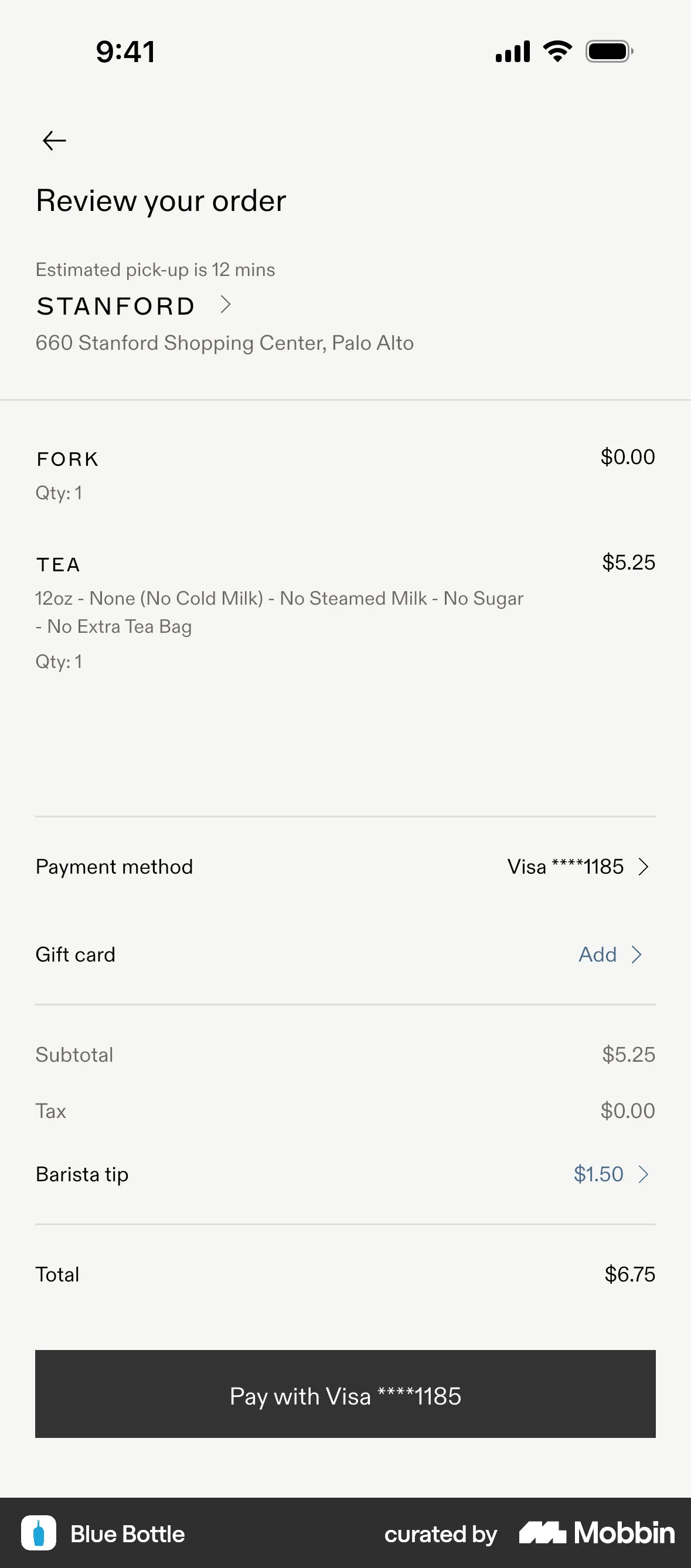
- Hold the pricing and checkout pages to the same visual standard as the landing page — typographic hierarchy, consistent spacing, real product imagery — since design look was raised in 46.1% of comments about site credibility, ahead of information structure. Never spend that credibility on fabricated badges, reviews, scarcity or reference prices: a page that looks trustworthy is exactly what vouches for them.
- Put the next sprint into the step users repeat — the retention flow, the weekly task, the cancellation path — rather than a second coat on the first-run screens. The rating lift from appearance is a first-contact effect that fades with exposure; the time on task does not.
- Hold polish to the legibility floor: WCAG 2.2 Success Criterion 1.4.3 requires at least 4.5:1 contrast for text and 3:1 for large-scale text at Level AA, and the refresh keeps visible focus states and text labels on icons. Light grey on white reads as clean in a design review and as a failure in an audit.
- Schedule the usability test on a polished build across more than one session, and compare session one against session three. A lift in perceived ease that only exists in the first session is the halo.
- Collect an appeal rating on the new version against the old before you treat a refresh as an aesthetic change at all. The meta-analysis admitted only studies whose versions differed significantly on subjective aesthetic ratings, and a refresh users do not find more attractive has no aesthetic effect to bank on.
What to avoid
- Treating a beautiful prototype as evidence the flow works. In the only study where masking appeared, the high-aesthetics cells did not register a usability manipulation worth 14 seconds a task, most of it deliberate delay — and that one session on the prettiest build is the condition under which appearance inflates ratings most.
- Reporting appeal or satisfaction as a usability result. In the same ATM data, post-use satisfaction correlated .87 with perceived usability and, separately, .71 with perceived aesthetics, so a satisfaction lift cannot tell you which of the two moved.
- Quoting “attractive things work better” as a performance claim. Pooled across 31 studies it is g = 0.29 with high unexplained heterogeneity, the largest single web experiment found nothing on accuracy or time, and the clearest speed gain appeared only where usability was poor.
- Trading legibility for visual calm — contrast below the 4.5:1 that WCAG 2.2 sets for body text at Level AA, type shrunk past readability, labels dropped for unlabelled icons. Styling that costs people the task is the failure mode this principle is named after.
- Using the halo to postpone a known usability fix. The effect lives in what people say at first contact and never appeared in completion time or error rate, so the cost of the broken step is paid in full from the first session onwards.
- Generalising from the ATM layouts. Those correlations are design-level averages over 26 static screens projected for about 15 to 20 seconds each; they say nothing about how much faster anyone got.
Real-world examples


Measuring it
- Primary metric: completion rate and time on task on the instrumented flow, per step, before and after the visual change. This is the measure that moved when the ATM was crippled while the ratings did not, and the one that stayed flat while Thielsch's ratings rose.
- Secondary: two separate scales, visual appeal collected at a brief fixed exposure and perceived ease of use, never one blended quality score. The appeal scale doubles as the manipulation check on the refresh.
- Track perceived usability per session across the first few sessions. The gap between the attractive and the plain version narrowed over two weeks, so a lift that shrinks between session one and session three was the halo, not an improvement.
- Backfire metric: divergence. Appeal or satisfaction up while support contacts, error rates, step drop-off or repeat attempts get worse. That pattern is beauty masking a problem, and it is the only version of this principle with an ethical problem.
- Backfire metric: accessibility regressions shipped with the refresh — text below 4.5:1, focus states removed, tap targets shrunk, labels replaced by icons. Audit the refresh, because a design review will read each of these as polish.
References
- Kurosu & Kashimura (1995). Apparent usability vs. inherent usability: experimental analysis on the determinants of the apparent usability. CHI '95 Conference Companion.
- Tractinsky (1997). Aesthetics and apparent usability: empirically assessing cultural and methodological issues. Proceedings of CHI 1997.
- Tractinsky, Katz & Ikar (2000). What is beautiful is usable. Interacting with Computers.
- Hassenzahl (2004). The interplay of beauty, goodness, and usability in interactive products. Human-Computer Interaction.
- Tuch, Roth, Hornbæk, Opwis & Bargas-Avila (2012). Is beautiful really usable? Toward understanding the relation between usability, aesthetics, and affect in HCI. Computers in Human Behavior.
- Hamborg, Hülsmann & Kaspar (2014). The interplay between usability and aesthetics: more evidence for the “what is usable is beautiful” notion. Advances in Human-Computer Interaction.
- Sonderegger & Sauer (2010). The influence of design aesthetics in usability testing: effects on user performance and perceived usability. Applied Ergonomics.
- Sonderegger, Zbinden, Uebelbacher & Sauer (2012). The influence of product aesthetics and usability over the course of time: a longitudinal field experiment. Ergonomics.
- Moshagen, Musch & Göritz (2009). A blessing, not a curse: experimental evidence for beneficial effects of visual aesthetics on performance. Ergonomics.
- Thielsch, Haines & Flacke (2019). Experimental investigation on the effects of website aesthetics on user performance in different virtual tasks. PeerJ.
- Schlamann, Nestler & Thielsch (2026). Attractive things do work better: a meta-analysis on visual aesthetics and user performance. International Journal of Human-Computer Interaction.
- Lindgaard, Fernandes, Dudek & Brown (2006). Attention web designers: you have 50 milliseconds to make a good first impression! Behaviour & Information Technology.
- Reinecke, Yeh, Miratrix, Mardiko, Zhao, Liu & Gajos (2013). Predicting users' first impressions of website aesthetics with a quantification of perceived visual complexity and colorfulness. Proceedings of CHI 2013.
- Fogg, Soohoo, Danielson, Marable, Stanford & Tauber (2003). How do users evaluate the credibility of Web sites? A study with over 2,500 participants. Proceedings of DUX 2003.
- W3C (2023). Web Content Accessibility Guidelines (WCAG) 2.2, Success Criterion 1.4.3 Contrast (Minimum).
For agents
An agent-friendly guide to this principle lives at /agents/aesthetic-usability-effect.md.
Our MCP server and skills for all principles are coming soon.
Similar principles
Disclaimer: The theories here are just that — theories. They may not apply universally and should be considered in context. Use your own judgment and consult additional sources when applying these principles.