Law of proximity
One of Wertheimer's grouping principles: the visual system organises an array into groups before anyone inspects it, and relative distance is one of the cues it uses. It is a cue about layout, not a claim that the grouping is true.
The perceptual claim is old and unusually well quantified. Wertheimer listed proximity among the factors that organise an array in 1923, and Kubovy, Holcombe and Wagemans turned it into a measurable function using dot lattices, where competing organisations differ only in inter-dot distance. As Wagemans and colleagues summarise, grouping “depends only on the relative distance between dots in competing organizations” and “decays as an exponential function of (relative) distance,” regardless of “the overall configuration in which the competition occurs,” and the slope of that function is “a person-dependent measure of sensitivity to proximity.” Kubovy and van den Berg found proximity and similarity additive. So even in the clean case the law fixes the shape of the effect, not its size for a given user: a spacing scale has to work as a set of ratios, because ratios are all the visual system reads.
Whitespace is the weakest grouping cue available, which is where the usual design advice goes wrong. Villalba-García and colleagues equated the strength of each cue for the visuomotor system first, then pitted cues against each other, and found “a consistent pattern of processing dominance of: (1) luminance similarity over proximity and (2) common region over connectedness.” Quinlan and Wilton found persuasive effects of both proximity and common colour, weak evidence for common shape, and that “both common colour and common shape were shown to override grouping by proximity, under certain conditions.” Palmer's common region — elements inside one bounded area group together — is reported as “capable of overcoming the effects of other powerful grouping factors such as proximity and similarity,” though on demonstration displays rather than a quantitative test. The build reading is the reverse of the folk rule: a card border or a shift in background tone beats a gap, so carry the grouping you can least afford to lose on the border, not the margin.
Connecting elements does not buy the same override. Palmer and Rock argued that uniform connectedness partitions the image before the classical principles act at all; Han, Humphreys and Chen tested that ordering with global-letter discrimination and found it half right. Connecting the elements speeded grouping by shape similarity, but “the discrimination of stimuli grouped by proximity was unaffected by connecting the local elements,” and only against weak proximity did connectedness come out faster. So a bounded region overrides proximity and a connecting line does not add to it.
At the interface level the measured record is thinner than the principle's popularity suggests, and it is almost all visual search. Niemelä and Saarinen found that “both the presence of icons and their grouping had a significant positive effect on the scanning speed.” Hornof compared labelled and unlabelled visual hierarchies and found the labelled ones “searched much more efficiently,” with “a fundamentally different strategy for each of the two structures” — the label, not the gap, is what let people skip whole groups. Spacing is not monotonically good either: Everett and Byrne's CHI paper is titled for its result, that varying icon spacing changes users' visual search strategy, and Reddy and VanRullen found the dependence task-specific, with more spacing significantly improving an upright-among-inverted face search, leaving a bisected-disk search poor, and doing nothing to two classically parallel searches.
The display literature that generalised proximity is the literature that found its limits. Wickens and Carswell's proximity compatibility principle pairs close display proximity with close task proximity, so grouping is only right when the task integrates the grouped items; for a value that must be read in isolation the prescription reverses. In the experiments behind it, Wickens and Andre varied how three aircraft stall indicators were displayed and found “spatial proximity had little effect on either focused attention or integration, whereas a distinct color code improved focused attention and disrupted integration.” Distance was the manipulation that did least.
What is missing is any controlled evidence for the interventions this principle is invoked to justify. No study here shows that regrouping form fields, boxing plan cards or widening a section gap moves completion, comprehension or conversion, and the narrower label question is openly unresolved: Tangmanee and Ruchikachorn eye-tracked 312 participants across left, top and in-field labels and found left-aligned labels noticed fastest but “the top or the infield alignments still outrank the left one” on fixations, while Das, McEwan and Douglas, on “a small sample of UK university-educated users,” recommended right alignment against prevailing guidance. Placement does move behaviour at scale where it has been measured, but as position rather than grouping: Utz and colleagues ran consent notices past more than 80,000 unique users and found “users are more likely to interact with a notice shown in the lower (left) part of the screen.” Treat this as a reliable fact about perception and an untested theory of conversion: use it to decide what reads as one thing, then test the thing you changed. The law runs whether or not the relationship is real, which is why putting a consent control next to an unrelated button is a legal problem rather than a style choice.
When it holds
- For relative, not absolute, distance. Grouping strength depends only on the ratio of competing distances and holds “under transformations of scale,” so a gap groups only against the other gaps on the screen and doubling all your spacing changes nothing.
- Only as strongly as the person. The slope of the proximity function is “a person-dependent measure of sensitivity to proximity,” so no distance produces a fixed amount of grouping across users.
- It loses to stronger cues. With cue strength equated, luminance similarity dominated proximity, and common colour and common shape have both overridden proximity under some conditions; a box or a tinted ground beats whitespace.
- Common region beats proximity, but on demonstration displays only. Palmer's claim that a bounded area overcomes proximity and similarity rests on demonstrations modelled on Wertheimer's, not a quantitative test.
- Connecting elements adds nothing once proximity is doing the work. Uniform connectedness speeded similarity-based grouping but left proximity-based grouping unchanged, and beat proximity only when the proximity cue was weak.
- Grouping helps only when the task integrates the grouped items. For a focused-attention task, where one value must be read alone, the proximity compatibility principle reverses — and an object display improved integration while disrupting focused attention.
- Spacing effects in search are task-specific. More spacing improved one serial search, left another poor, and did nothing to two parallel searches; varying icon spacing also changes which strategy people use rather than simply speeding them up.
- A label beats a gap for scanning. Labelled groups were searched much more efficiently than unlabelled groups of the same structure, so proximity alone buys less than proximity plus a name.
- Visual grouping is not programmatic grouping, and it cannot override touch spacing. WCAG 2.2 Success Criterion 1.3.1 (Level A) requires presentation-conveyed relationships to be programmatically determinable, and the Spacing exception to 2.5.8 (Level AA) holds only when a 24 CSS pixel circle centred on each undersized target misses its neighbours.
How to apply
- Set spacing as a ratio: the gap between groups should be visibly larger than the gap inside one, since grouping follows relative distance. One scale step of difference reads as nothing — aim for roughly double, and change both numbers together.
- Carry every grouping that matters on a card border, a background tint or a group heading as well as the gap, and add a heading once a screen has more than about four groups. Common region and similarity win when they disagree with proximity, and the heading is what lets someone skip a block.
- Keep each label, hint and error message closer to its own field than to the next field, and write the association into the markup with a label-for-id pair rather than relying on the gap. Above and inside the field both have eye-tracking support; what to avoid is a label ambiguous between two fields.
- Put each number next to the thing it prices and nothing else: fees, taxes and discounts in a block adjacent to the total, the per-seat price inside its plan card, the trial terms beside the button that starts the trial rather than in a footer.
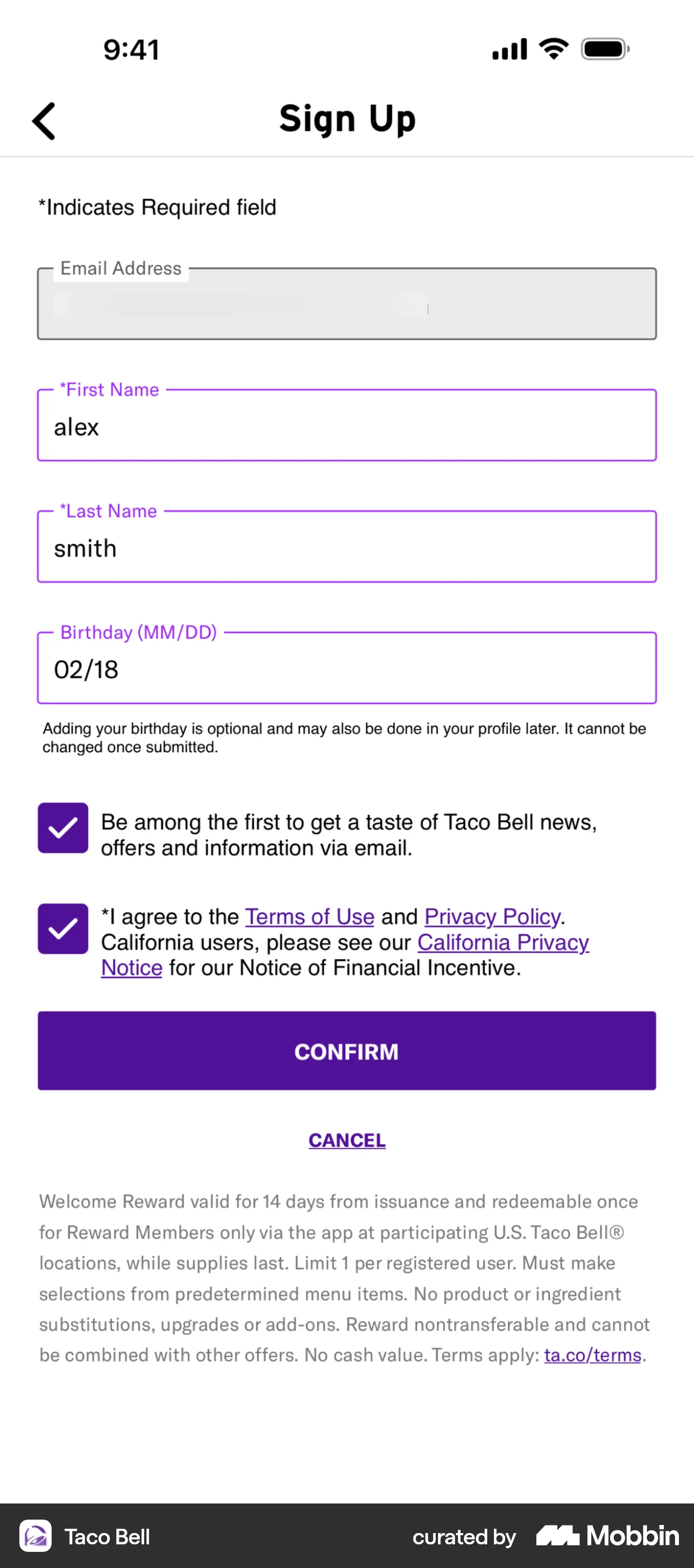
- Give consent, marketing opt-in and terms controls their own region, separated from the primary action by a clear band of space, so no checkbox sits visually inside the button's group. GDPR Article 7(2) requires a consent request bundled with other matters to be “presented in a manner which is clearly distinguishable from the other matters.”
- Put the information a decision depends on immediately before the control that commits it. Regulation 14 of the UK Consumer Contracts Regulations 2013 requires price, duration and cancellation terms to be given clearly and prominently “directly before the consumer places the order,” with the button labelled “order with obligation to pay” or equally unambiguous wording.
- Group settings by what someone changes in one sitting, not by the data model: notification channels together, billing and plan together, privacy together. The proximity compatibility principle predicts a benefit only where the grouped items are used in the same task.
- In a cancellation or delete flow, put the destructive confirm and the stay-here option in separate groups at full width with real space between them. Proximity will otherwise make the pair read as one control with an emphasis.
What to avoid
- Placing a consent checkbox, a pre-ticked opt-in or an upsell inside the visual group that belongs to the primary action. The proximity does the misrepresenting: it says these are one decision. GDPR Article 7(2) makes clearly distinguishable presentation a condition of valid consent, and “any part of such a declaration which constitutes an infringement of this Regulation shall not be binding.”
- Separating a disclosure from the claim it qualifies. The FTC's Endorsement Guides define “clear and conspicuous” as a disclosure “difficult to miss (i.e., easily noticeable) and easily understandable by ordinary consumers,” count “its size, contrast, location, the length of time it appears” among the qualities that must make it stand out, and require that in an interactive medium “the disclosure should be unavoidable.” A footnote far from a strikethrough price fails on location.
- Pushing price, renewal terms or cancellation rights away from the order button. Under regulation 14(5) of the UK Consumer Contracts Regulations 2013, if the trader does not secure an explicit acknowledgement of the payment obligation or label the button accordingly, “the consumer is not bound by the contract or order.”
- Treating visual grouping as the whole of the relationship. A fieldset drawn with spacing, a label sitting near an input and an error message floating under a form all convey nothing programmatically; WCAG 2.2 requires structure and relationships to be determinable in code (1.3.1, Level A) and labels or instructions to be provided when content requires input (3.3.2, Level A).
- Tightening groups until touch targets collide. Dense grouping that puts controls within 24 CSS pixels of each other breaks the Spacing exception to WCAG 2.2 Success Criterion 2.5.8 and raises mis-taps on whichever neighbour sits closest to the thumb.
- Grouping items that are never used together because it looks tidy. Close display proximity is predicted to help only when task proximity is close; for values read in isolation, the same manipulation that aids integration disrupts focused attention.
- Claiming a conversion effect for a spacing change. There is no controlled evidence here that regrouping fields or boxing cards moves completion or revenue, and spacing has been shown to change search strategy in both directions.
- Quoting the folk rule that proximity overpowers colour and shape. In objective tasks it goes the other way often enough that the safe assumption is the reverse: equated for strength, luminance similarity dominated proximity.
Real-world examples




Measuring it
- Primary metric: time to the first correct interaction with the target control on the changed screen, since the measured effects of grouping are on visual search rather than on willingness. Gaze or first-click data localises it better than page-level timing.
- Secondary: a comprehension check naming the relationship you encoded — which fee belongs to which line, which fields are one section, what the checkbox applies to — plus error rate per field, where label mis-association shows up as values in the wrong field and re-edits after an error.
- Backfire metric: opt-in rate on any consent or marketing control near the primary action, tracked separately from conversion. A grouping change that lifts opt-ins without lifting comprehension has moved the reading of the control, which is the version a regulator reads as a deceptive pattern.
- Backfire metric: mis-taps and immediate undo on adjacent controls, especially destructive ones and the keep/cancel pair, plus refunds and support contacts saying something was not expected to be included.
- Backfire metric: search time on the dense screens you tightened. Spacing is not monotonic, so check the screens you did not intend to change.
References
- Wertheimer (1923). Untersuchungen zur Lehre von der Gestalt. II. Psychologische Forschung.
- Kubovy, Holcombe & Wagemans (1998). On the lawfulness of grouping by proximity. Cognitive Psychology.
- Kubovy & van den Berg (2008). The whole is equal to the sum of its parts: a probabilistic model of grouping by proximity and similarity in regular patterns. Psychological Review.
- Wagemans, Elder, Kubovy, Palmer, Peterson, Singh & von der Heydt (2012). A century of Gestalt psychology in visual perception: I. Perceptual grouping and figure-ground organization. Psychological Bulletin.
- Palmer (1992). Common region: a new principle of perceptual grouping. Cognitive Psychology.
- Palmer & Rock (1994). Rethinking perceptual organization: the role of uniform connectedness. Psychonomic Bulletin & Review.
- Han, Humphreys & Chen (1999). Uniform connectedness and classical Gestalt principles of perceptual grouping. Perception & Psychophysics.
- Quinlan & Wilton (1998). Grouping by proximity or similarity? Competition between the Gestalt principles in vision. Perception.
- Villalba-García, Jimenez, Luna, Hinojosa & Montoro (2021). Competition between perceptual grouping cues in an indirect objective task. Quarterly Journal of Experimental Psychology.
- Wickens & Carswell (1995). The proximity compatibility principle: its psychological foundation and relevance to display design. Human Factors.
- Wickens & Andre (1990). Proximity compatibility and information display: effects of color, space, and objectness on information integration. Human Factors.
- Niemelä & Saarinen (2000). Visual search for grouped versus ungrouped icons in a computer interface. Human Factors.
- Hornof (2001). Visual search and mouse-pointing in labeled versus unlabeled two-dimensional visual hierarchies. ACM Transactions on Computer-Human Interaction.
- Everett & Byrne (2004). Unintended effects: varying icon spacing changes users' visual search strategy. Proceedings of CHI 2004.
- Reddy & VanRullen (2007). Spacing affects some but not all visual searches: implications for theories of attention and crowding. Journal of Vision.
- Tangmanee & Ruchikachorn (2018). Online forms: an eye tracking exploration into fixation across three label alignments. Proceedings of ICSEC 2018.
- Das, McEwan & Douglas (2008). Using eye-tracking to evaluate label alignment in online forms. Proceedings of NordiCHI 2008.
- Utz, Degeling, Fahl, Schaub & Holz (2019). (Un)informed consent: studying GDPR consent notices in the field. Proceedings of ACM CCS 2019.
- W3C (2023). Web Content Accessibility Guidelines (WCAG) 2.2, Success Criteria 1.3.1 Info and Relationships, 3.3.2 Labels or Instructions and 2.5.8 Target Size (Minimum).
- Regulation (EU) 2016/679 (GDPR), Article 7(2), as retained in UK law.
- The Consumer Contracts (Information, Cancellation and Additional Charges) Regulations 2013, regulation 14.
- FTC Guides Concerning the Use of Endorsements and Testimonials in Advertising, 16 C.F.R. § 255.0(f) (2023).
For agents
An agent-friendly guide to this principle lives at /agents/law-of-proximity.md.
Our MCP server and skills for all principles are coming soon.
Similar principles
Disclaimer: The theories here are just that — theories. They may not apply universally and should be considered in context. Use your own judgment and consult additional sources when applying these principles.