Processing fluency
The tendency to read the subjective ease of processing as information about the content itself. Clear type, plain words and simple layouts feel effortless, and people misattribute that effortlessness to the message being truer or safer.
Processing fluency is the subjective ease with which information is taken in, and the claim is that people read that feeling as information about the content. Alter and Oppenheimer's review gathered manipulations as different as semantic priming, visual clarity and phonological simplicity under one continuum from effortless to demanding, which is why fluency gets cited for almost any design decision. The evidence underneath is far more uneven than that framing suggests, and it is strongest for the least interesting claims.
The famous claim — easy to read means judged true — has largely collapsed. Reber and Schwarz showed trivia statements in high or low colour contrast, and across the published set only two experiments produced a clear positive result, at d = 0.252 and d = 0.396. Aktepe and Heck ran two online replications, the second preregistered, and found no effect of contrast on truth judgments even though high-contrast statements were read reliably faster, so the manipulation itself worked. Their robust Bayesian meta-analysis of the eight experiments put the effect at Cohen's d = 0.023, with BF01 = 3.66 favouring the null and moderate evidence of publication bias. Making a sentence more legible does not make readers believe it.
What does reliably raise perceived truth is repetition, the other common source of fluency. Fazio, Rand and Pennycook's preregistered experiment found that repetition increased belief at every level of plausibility, including statements that were obviously implausible. That is the dangerous half of this principle, and the reason repetition sits in the ethical line below rather than in the build advice: a familiar, repeatedly surfaced claim gains credibility it has not earned.
Fluency does shift judgments other than truth. Oppenheimer found that heavier lexical complexity lowered the judged intelligence of a text's author regardless of the quality of the original essay, and that the same text set in a hard-to-read font was judged to come from a less intelligent author. His fifth experiment is the useful caveat: when an obvious irrelevant cause of the difficulty is available, such as a bad photocopy, people discount the fluency cue and overcorrect against it, so a visibly broken render does not cost you the way bad writing does.
Low fluency also reads as unfamiliar, and unfamiliar cuts both ways. Song and Schwarz showed that hard-to-read instructions raise predicted effort and lower willingness to adopt a routine, which is the finding closest to onboarding work. Their companion study found hard-to-pronounce food additives rated more harmful, and hard-to-pronounce amusement rides rated both more likely to make you sick and more exciting and adventurous. Expect an awkward name to read as risky, which helps a ride and hurts an ingredient list.
The inverse idea, that deliberate disfluency makes people think harder, has not survived. Diemand-Yauman, Oppenheimer and Vaughan reported that hard-to-read fonts improved memory in the lab and in high-school classrooms, and it became the standard citation for ugly-on-purpose typography. Meyer and colleagues then pooled the original disfluent-font reasoning experiment with 16 replication attempts and found no effect on solution rates and no benefit under any moderator they tested, although disfluent fonts did slightly slow responses. Xie, Zhou and Liu's meta-analysis of text-based learning is titled for its own result, null effects; Weissgerber, Brunmair and Rummer found coding and sign errors in it and corrected the pooled transfer effect from +0.026 to −0.008, so the number moved but stayed at zero. Nothing here supports degrading legibility on purpose.
The best field evidence for simplicity is about cutting content, not polishing it. Bertrand, Karlan, Mullainathan, Shafir and Zinman randomised the content, price and deadline of direct-mail loan offers from a South African consumer lender, and showing fewer example loans raised loan demand by about as much as a 25% reduction in the interest rate. The authors stress that they could not predict in advance which advertising features would matter, which is the right posture: simplification moved real money, but through what the offer said rather than through how it was set.
So treat fluency as a floor rather than a lever. Legible contrast, plain words and short sentences are a baseline obligation — WCAG 2.2 sets 4.5:1 for normal text, UK GDPR Article 12(1) requires clear and plain language, and the Unfair Commercial Practices Directive Article 7(2) makes material information presented in an unclear, unintelligible or ambiguous manner a misleading omission. Expect comprehension and completion gains from clearing obstacles; do not expect polish alone to make a claim persuasive, and do not use it to smooth over a claim that is not true.
When it holds
- Effort predictions: hard-to-read instructions raised estimated effort and lowered willingness to adopt a routine (Song & Schwarz, 2008).
- Judgments of the author: more complex wording and harder fonts lowered judged intelligence, mediated by fluency (Oppenheimer, 2006).
- Not for truth judgments from legibility: a robust Bayesian meta-analysis of eight contrast experiments puts the effect at d = 0.023 (Aktepe & Heck, 2025).
- For truth, repetition is the source that works, at every level of plausibility, including implausible claims (Fazio, Rand & Pennycook, 2019).
- The cue is discounted when an obvious irrelevant cause of the difficulty exists, and people then overcorrect against it (Oppenheimer, 2006, Experiment 5).
- Low fluency signals unfamiliarity rather than badness: hard-to-pronounce rides were rated both more sickening and more exciting (Song & Schwarz, 2009).
- Absent for learning: disfluent fonts showed no benefit across the original plus 16 replications (Meyer et al., 2015), and near-zero pooled effects in text-based learning (Xie et al., 2018; Weissgerber et al., 2021).
- Simplifying what is said beats restyling how it looks: fewer example loans in a mailer moved demand like a 25% rate cut (Bertrand et al., 2010).
How to apply
- Put the decisive fact of the screen — the price, the permission, the consequence of the button — in one short plain sentence, and move the detail below it instead of inside it.
- Show one worked example rather than a comparison set. In the mailer field experiment, fewer example loans sold better.
- Hold body copy at 4.5:1 contrast and set instructions in the plain text face: no grey on grey, no all-caps paragraphs, no condensed or decorative type, and never a harder face to force attention.
- Label plans, features and ingredients with pronounceable, familiar words, because an awkward name reads as unfamiliar and unfamiliar reads as risky.
- State the steps and the real time cost before a multi-step task starts, since instructions that look hard inflate predicted effort and lower willingness to begin.
- Rewrite a cancellation, consent or fee screen that needs a second read rather than enlarging it, and cut steps before polishing their wording.
What to avoid
- Dressing a false or unsupported claim in clean type. Fluency is a feeling about the reading, not evidence about the content, and this is the principle's ethical line.
- Repeating a marginal claim across onboarding, email and in-app banners to make it feel settled. Repetition raises perceived truth even for implausible statements.
- Claiming the legibility-makes-it-believed effect as the reason for a design. The pooled estimate is effectively zero and shows signs of publication bias.
- Using plain, friendly wording to make a material term smaller: under UCPD Article 7(2), material information given in an unclear, unintelligible or ambiguous manner is a misleading omission.
- Hiding behind legalese in consent and privacy copy. UK GDPR Article 12(1) requires concise, intelligible, clear and plain language.
- Understating effort to raise intent. Instructions that read as effortless and then are not produce a predictable abandon at the first hard step.
Real-world examples



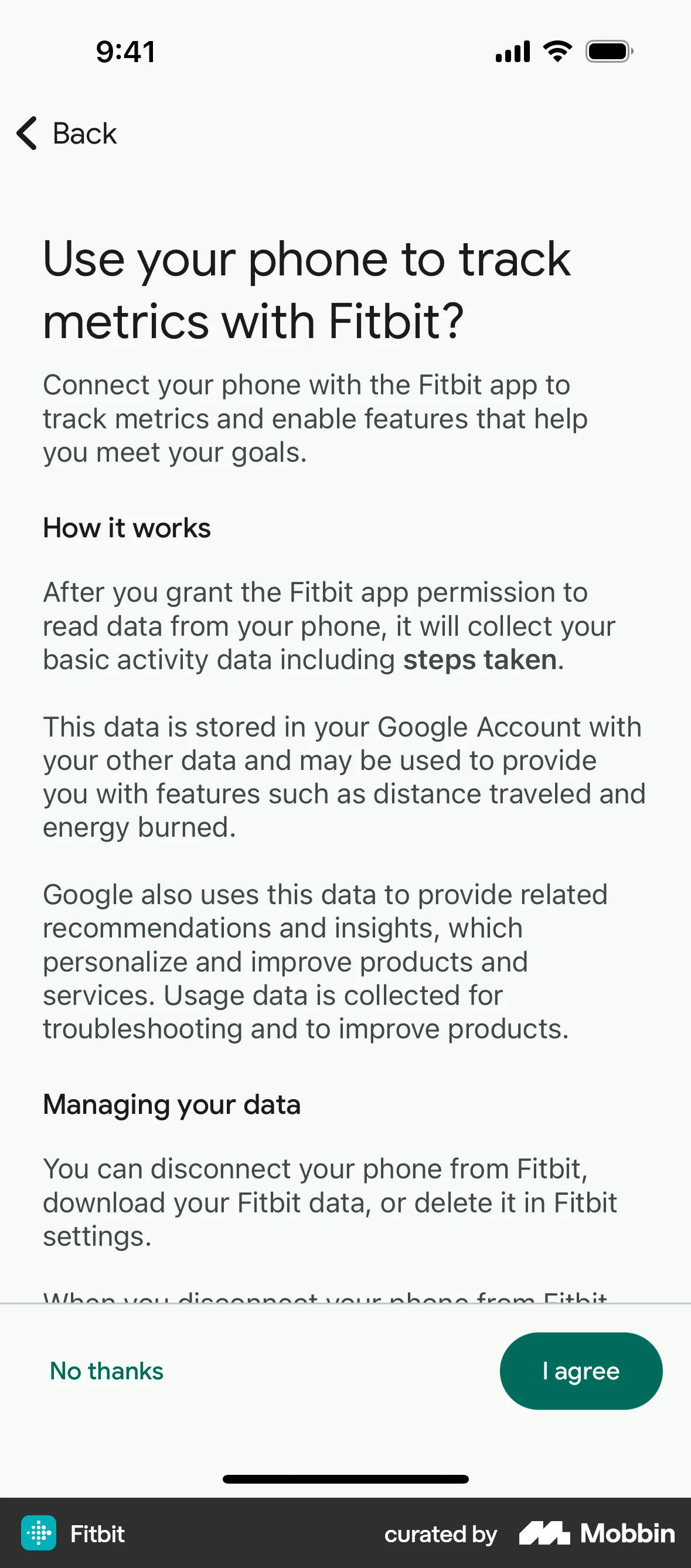

Measuring it
- Primary: completion rate of the flow whose copy and layout you simplified, split by first-time and returning users.
- Secondary: comprehension checks on the material terms — price, renewal, cancellation — asked after the screen rather than on it, alongside time to first action and support contacts naming that screen.
- Backfire: refunds, chargebacks and early cancellations citing “I did not understand what I signed up for”. Smooth copy that hides a term shows up here, not in conversion.
- Backfire: drop-off at the first effortful step after an onboarding promise, which catches effort being understated rather than reduced.
- Backfire: accessibility regressions — contrast failures, text-resize breakage — introduced while chasing a cleaner look.
References
- Alter & Oppenheimer (2009). Uniting the Tribes of Fluency to Form a Metacognitive Nation. Personality and Social Psychology Review.
- Reber & Schwarz (1999). Effects of Perceptual Fluency on Judgments of Truth. Consciousness and Cognition.
- Aktepe & Heck (2025). Revisiting the effect of discrepant perceptual fluency on truth judgments. Journal of Experimental Social Psychology.
- Fazio, Rand & Pennycook (2019). Repetition increases perceived truth equally for plausible and implausible statements. Psychonomic Bulletin & Review.
- Oppenheimer (2006). Consequences of erudite vernacular utilized irrespective of necessity. Applied Cognitive Psychology.
- Song & Schwarz (2008). If It's Hard to Read, It's Hard to Do: Processing Fluency Affects Effort Prediction and Motivation. Psychological Science.
- Song & Schwarz (2009). If It's Difficult to Pronounce, It Must Be Risky. Psychological Science.
- Diemand-Yauman, Oppenheimer & Vaughan (2011). Fortune favors the bold (and the italicized): Effects of disfluency on educational outcomes. Cognition.
- Meyer et al. (2015). Disfluent fonts don't help people solve math problems. Journal of Experimental Psychology: General.
- Xie, Zhou & Liu (2018). Null Effects of Perceptual Disfluency on Learning Outcomes in a Text-Based Educational Context: a Meta-analysis. Educational Psychology Review.
- Weissgerber, Brunmair & Rummer (2021). Null and Void? Errors in Meta-analysis on Perceptual Disfluency. Educational Psychology Review.
- Bertrand, Karlan, Mullainathan, Shafir & Zinman (2010). What's Advertising Content Worth? Evidence from a Consumer Credit Marketing Field Experiment. Quarterly Journal of Economics.
- W3C (2023). WCAG 2.2, Success Criterion 1.4.3 Contrast (Minimum). W3C Recommendation.
- UK GDPR, Article 12(1). Transparent information, communication and modalities. legislation.gov.uk.
- Unfair Commercial Practices Directive 2005/29/EC, Article 7. Misleading omissions. legislation.gov.uk.
For agents
An agent-friendly guide to this principle lives at /agents/processing-fluency.md.
Our MCP server and skills for all principles are coming soon.
Similar principles
Disclaimer: The theories here are just that — theories. They may not apply universally and should be considered in context. Use your own judgment and consult additional sources when applying these principles.