Progressive disclosure
Progressive disclosure splits an interface into a small default layer and deeper layers revealed on request. The first layer is easier because there is less to read and fewer ways to go wrong; the deeper layers are quiet because hardly anyone opens them.
The pattern rests on one pair of small experiments. Carroll and Carrithers disabled rather than removed the functions new learners rarely need in a commercial word processor — the ones that act as springboards for errors and confusion — and reported better learning efficiency, in one experiment on learning by doing and one on learning from the manual. That is 1984, one lab, a text-only editor, measured as learning rather than as conversion, and the companion paper in Communications of the ACM is paywalled, so its numbers could not be verified in this run. Treat the training-wheels result as a direction rather than an effect size.
The chunking evidence that is genuinely strong is about lessons, not interfaces. Rey and colleagues' meta-analysis of segmenting, pooled in Noetel and colleagues' overview of 29 reviews covering 1,189 studies and 78,177 participants, found chunked material improved learning at g = 0.34 and modestly reduced perceived load at g = 0.23. Two details in the same analysis cut against the way product teams use it. Segmenting cost time — learners took considerably longer with segmented material, g = 0.92 — and segments chosen by the instructor beat segments the learner chose, g = 0.41 against g = 0.20. The gain comes from someone deciding what belongs together, not from handing the user an expander.
In forms, the place teams reach for it most, the controlled evidence runs the other way. Mavletova and Couper randomised 2,000 invitations each to a scrolling and a paging version of the same mobile questionnaire. Paging, one question per screen, took twice as long — 9.1 minutes against 4.5 — and did not reduce dropout: breakoff was 10.2% against 8.0%, not significant at p = 0.067. It moved the dropout instead. First-screen breakoff was 3.3% with paging against 6.0% with scrolling, then 6.9% against 2.1% on the screens after it, and over the same first eight questions the cumulative rates were indistinguishable, 6.0% and 7.5%. Item nonresponse did not differ, and more people reported technical problems with paging, 25.8% against 18.9%. It is one volunteer panel in Russia, but the PC precedent it replicates is large: Peytchev and colleagues ran over 21,000 undergraduates through up to 268 questions, and in both studies respondents rated scrolling more satisfying. Splitting a form chooses where you lose people, not whether.
Hiding the way around a product has a measured cost in discoverability. The best quantitative test is practitioner work, not peer review: Pernice and Budiu ran 179 participants through two tasks on each of six live sites, on desktop and phone, comparing hidden, visible and combo navigation. Hidden navigation was used in 27% of desktop cases against 48% visible and 50% combo, and in 57% of mobile cases against 86% combo; content discoverability dropped by more than 20% on both devices; tasks took at least 39% longer on desktop and 15% longer on mobile; and participants rated the hidden version 21% harder. It is unmoderated remote testing on 2016 sites with no published statistics beyond the differences, so read it as the size of the risk rather than a coefficient.
The deeper layer, meanwhile, is close to unread. Bakos, Marotta-Wurgler and Trossen tracked around 48,000 monthly visitors to the sites of 90 online software firms: one or two shoppers in every thousand opened the licence agreement at all, most of them reading a fraction of it. Obar and Oeldorf-Hirsch had 543 people join a fictitious social network: 74% took the quick-join option and skipped the privacy policy, those who opened it spent 73 seconds on a document needing 29 to 32 minutes at adult reading speed, 97% accepted it, and 98% missed clauses handing their data to the NSA and their employer and their first-born child to the service. Springer and Whittaker add a subtler failure: offered both a coarse summary and a word-by-word explanation of the same sentiment model, their 74 participants split 37 to 37 on which they preferred, and 24% of those choosing the coarse view praised it for weighing their whole text — which was false, since both ran the identical word-level model. Anything behind a disclosure is, for practical purposes, not shown, and a thin layer can leave a flattering wrong mental model rather than none.
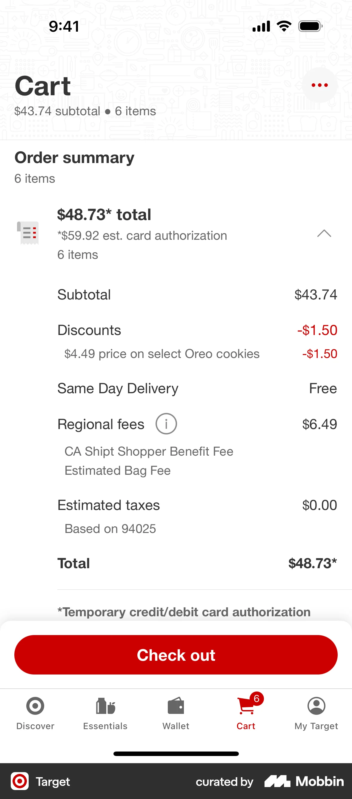
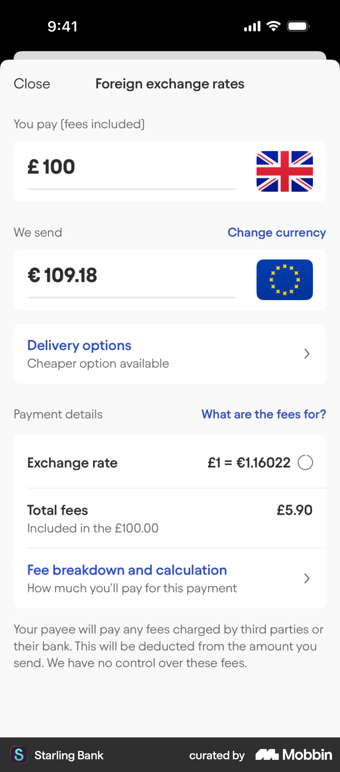
The line between deferring detail and hiding terms is drawn in law rather than in taste. Blake and colleagues moved fees from the listing page to checkout for several million StubHub users over ten days, raising revenue about 21% and the transaction rate 14.1%, with at least 28% of the gain coming from people buying better seats than they would have chosen with the fee in view. Deferred cost is profitable, which is why it is now regulated. The FTC's Rule on Unfair or Deceptive Fees, 16 CFR Part 464, effective 12 May 2025, requires any price shown for a live-event ticket or short-term lodging to carry the total price clearly and conspicuously and “more prominently than any other pricing information,” and defines clear and conspicuous in an interactive medium to mean the disclosure “must be unavoidable” — a definition a disclosure behind a tap fails by construction. Article 6(1)(e) of the Consumer Rights Directive requires the total price inclusive of taxes and any delivery charges before the consumer is bound, and under Article 6(6), where those charges were not disclosed, “the consumer shall not bear those charges or costs.” The EDPB endorses layered privacy notices for the concise-and-easily-accessible requirement of Article 12(1) GDPR, then bounds it: the layered approach “may not be misused to hide information in deeper layers or by adding unnecessary layers,” a control buried across many pages is the Privacy Maze pattern in Annex I 4.1.2 and runs contrary to Article 12(2), and for exercising rights “the number of steps should be as low as possible.” Mathur and colleagues' crawl of roughly 11,000 shopping sites puts the measured prevalence low — 1,818 dark patterns across 1,254 sites, of which 5 were hidden costs, 7 sneak-into-basket and 14 hidden subscriptions — but the crawler only visited product, cart and checkout pages, so those are a floor, not a census.
So the honest grade is mixed, and the asymmetry matters more than the average. That hiding the rare and advanced helps rests on one 1984 pair of experiments plus a learning literature about chunked lessons that also measures the time it costs; that what you hide stays hidden has far better support, from one-in-a-thousand licence openings to a fifth less content discovered behind a menu icon. Use progressive disclosure for optional depth — the breakdown, the advanced setting, the explanation someone might want — and keep the complete set of facts a decision actually needs in the first layer, because that is the layer users read.
When it holds
- The hidden material is genuinely optional. The founding study disabled functions new learners rarely need, and the measured benefit was learning efficiency, not throughput.
- Someone else decides the chunks. Segmenting chosen by the instructor was worth g = 0.41 against g = 0.20 when learners segmented for themselves, so the gain comes from editorial judgement, not from adding an expander.
- You are buying comprehension with time, not saving time. Segmented material improved learning at g = 0.34 but took substantially longer to get through, g = 0.92.
- Not in forms, on the current evidence. One question per screen doubled completion time, 9.1 minutes against 4.5, and did not significantly reduce breakoff, 10.2% against 8.0%.
- Splitting a form moves dropout rather than removing it. First-screen breakoff was 3.3% paging against 6.0% scrolling, but 6.9% against 2.1% on the screens after it, and the cumulative rates over the same eight questions were indistinguishable.
- It reverses for navigation and anything to be found. Hidden navigation cut content discoverability by more than 20% and added at least 39% to desktop task time in a 179-participant practitioner study.
- Never for material terms. One or two shoppers in a thousand open a licence agreement, and 74% of people skipped a privacy policy outright when a quick-join button was available.
- Hiding the mechanism can inflate trust rather than reduce it. A quarter of those preferring a coarse explanation praised it for weighing their whole text, when both versions ran the same word-level model.
- Legally, not at all where price is concerned. The FTC rule requires the total price for covered goods to be disclosed unavoidably and more prominently than any other pricing information; Article 6(1)(e) of the Consumer Rights Directive counts a subscription's total costs per billing period as part of that total price, and Article 6(6) makes undisclosed charges unenforceable. Neither instrument says a disclosure one tap away satisfies it.
How to apply
- Put the complete set of facts the decision needs in the first layer and only the depth behind the disclosure: the total price visible with the line-by-line breakdown on tap, the permission's consequence visible with the retention schedule one layer down. Design the layer as if it is never opened — deferring the breakdown is safe only because the total it explains is already on the screen.
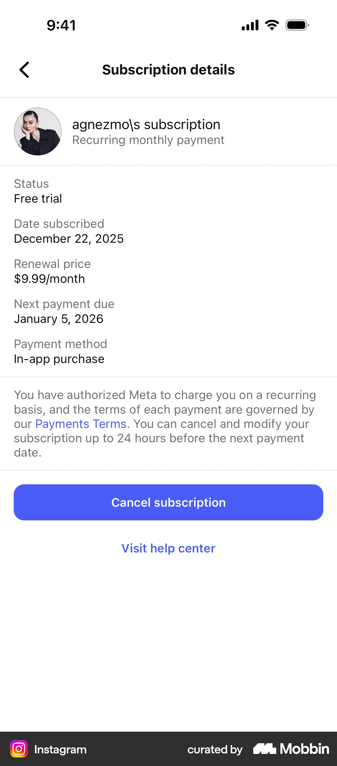
- Keep the facts the pre-contract rules name on the screen, and link only what they do not. Article 6(1)(e) of the Consumer Rights Directive counts a subscription's total costs per billing period as part of the total price, and Article 6(1)(o) adds the duration and the conditions for terminating, so the renewal date and the per-period amount belong next to the button; a link is for the remainder of the terms, and nothing in the cited instruments makes a link a disclosure for the facts they require.
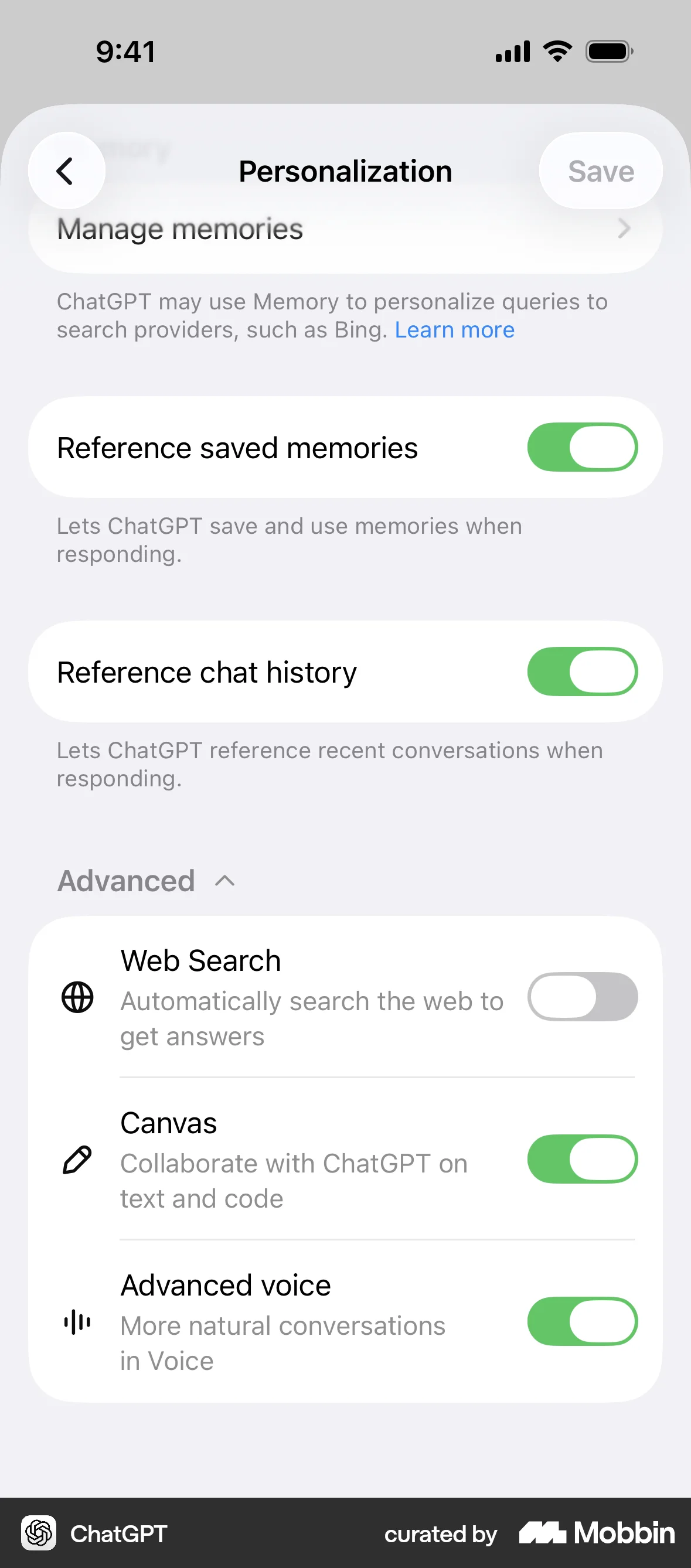
- Split settings by frequency, not by complexity. The handful used in the first session stay on the screen; the rest go into one labelled “Advanced” group rather than a chain of nested panels.
- Label the trigger with what is inside it and count it: “See the 3 excluded fees”, “4 advanced options”, “How is this calculated?” — never “More”, “Details” or a bare chevron. A number tells someone whether the layer is worth opening; a chevron does not.
- Ship accordions as real disclosure widgets. A native `<details>` and `<summary>` gives you the keyboard handling and the expanded state for free; build it yourself and you owe the full pattern — a button as the trigger, Enter and Space both toggling it, aria-expanded true or false on the button and an optional aria-controls pointing at the region. A styled div that only responds to a click is invisible to a keyboard and to a screen reader.
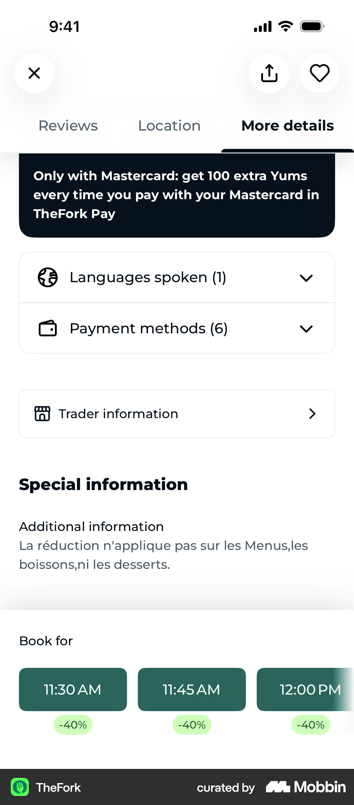
- Keep collapsed text findable. Browser find-in-page skips content hidden with display: none, so build the disclosure as a native `<details>` with the trigger in its `<summary>`: the HTML standard's ancestor revealing algorithm sets the open attribute on a closed details element when a find-in-page or fragment match lands inside it. The platform's hidden="until-found" state does the same for content outside a details element, but it is not available in this codebase — React types hidden as a boolean and react-dom serialises any truthy value as hidden="", which is display: none, the exact trap.
- Give any hover or focus reveal the three WCAG 2.2 properties at Level AA: dismissible without moving the pointer or focus, hoverable so the pointer can enter it, and persistent until the trigger is removed or the user dismisses it. Otherwise put the content inline and skip the tooltip.
- Keep cancellation, export, consent withdrawal and the fee schedule at the top level, reachable in one step from the menu. The EDPB's position on exercising rights is that the number of steps should be as low as possible, and a route that only exists inside a help article is a dead end in their taxonomy.
- Default to showing a long form on one scrollable screen with labelled sections, and reserve step-by-step for branching that genuinely depends on an earlier answer.
What to avoid
- Deferring any mandatory cost. The FTC's Rule on Unfair or Deceptive Fees, effective 12 May 2025, requires the total price for live-event tickets and short-term lodging to be disclosed clearly and conspicuously and “more prominently than any other pricing information,” and defines clear and conspicuous in an interactive medium as a disclosure that “must be unavoidable.” In the EU, Article 6(1)(e) of Directive 2011/83/EU requires the total inclusive price up front and Article 6(6) provides that the consumer “shall not bear those charges or costs” if it was not given.
- Putting the subscription, the renewal or the trial's end date behind a “Learn More”. That is the Hidden Subscription pattern in Mathur and colleagues' taxonomy — their example is a $89 annual charge disclosed only to users who clicked through — and it is classed as deceptive and information-hiding on their own coding scheme.
- Treating a link to a policy as disclosure. One or two retail software shoppers in a thousand open the licence agreement, and 98% of participants in a sign-up experiment missed clauses in a policy they had agreed to. If a fact changes whether a reasonable person would proceed, it belongs on the screen with the button.
- Adding layers to make a first screen look clean. The EDPB states that the layered approach “may not be misused to hide information in deeper layers or by adding unnecessary layers,” and that the higher the number of layers, the more it can be assumed users will be discouraged or misled.
- Hiding primary navigation behind an icon. In the one large practitioner test, hidden navigation was used in 27% of desktop cases against 48% when visible, cost more than 20% of content discoverability, and added at least 39% to task time — the pattern suits secondary destinations, not the main ones.
- Simplifying the explanation of an automated decision to the point where it flatters the system. A quarter of users who preferred a coarse sentiment summary believed it read their whole text, when it ran the same word-by-word model as the detailed view; a layer that produces a wrong mental model is worse than no layer.
- Making the collapsed state the place where the choice already happened. A preselected consent, an opted-in add-on or a prefilled amount inside a closed accordion is a decision taken on the user's behalf and hidden from them, not progressive disclosure.
Real-world examples
Measuring it
- Primary metric: completion of the whole task, not of the first screen. In the one mobile survey experiment that measured both, splitting the flow improved the first step and moved the loss downstream — first-screen breakoff fell from 6.0% to 3.3% while later-screen breakoff rose from 2.1% to 6.9%, leaving the cumulative rate over the same questions indistinguishable. Whether your flow does the same is what this metric is for; a first-screen gain on its own tells you nothing.
- Secondary: time to complete, measured end to end. Both the segmenting meta-analysis and the paging experiment found the chunked version slower, g = 0.92 and 9.1 minutes against 4.5, so a design that looks lighter per screen can cost minutes overall.
- Backfire metric: discoverability of whatever you moved into a layer. Instrument the trigger — impressions, open rate, completion conditional on having opened — and track the share of users who ever use the feature, reach the setting or find the page against the visible-navigation baseline. An open rate near zero on a layer you consider important is the finding, and roughly a fifth of discovery goes missing when something moves behind an icon.
- Backfire metric: surprise at the point of payment. Watch checkout abandonment on the screen where a fee first appears, refund and chargeback requests citing an unexpected charge, cancellations within one billing cycle, and support contacts asking what a line item is. Fees shown late move the exit to checkout rather than removing it.
- Backfire metric: comprehension, asked rather than inferred. Put one question to a sample after the flow — what will you be charged, when does it renew, what did you just allow — and compare it against the variant with the facts on the screen. Satisfaction can rise while accuracy falls.
References
- Carroll & Carrithers (1984). Blocking learner error states in a training-wheels system. Human Factors.
- Carroll & Carrithers (1984). Training wheels in a user interface. Communications of the ACM.
- Springer & Whittaker (2019). Progressive disclosure: empirically motivated approaches to designing effective transparency. Proceedings of IUI 2019 (cited from the authors' preprint).
- Rey, Beege, Nebel, Wirzberger, Schmitt & Schneider (2019). A meta-analysis of the segmenting effect. Educational Psychology Review.
- Noetel, Griffith, Delaney, Harris, Sanders, Parker, del Pozo Cruz & Lonsdale (2022). Multimedia design for learning: an overview of reviews with meta-meta-analysis. Review of Educational Research.
- Mavletova & Couper (2014). Mobile web survey design: scrolling versus paging, SMS versus e-mail invitations. Journal of Survey Statistics and Methodology.
- Peytchev, Couper, McCabe & Crawford (2006). Web survey design: paging versus scrolling. Public Opinion Quarterly.
- Pernice & Budiu (2016). Hamburger menus and hidden navigation hurt UX metrics. Nielsen Norman Group (practitioner study, not peer reviewed).
- Blake, Moshary, Sweeney & Tadelis (2018). Price salience and product choice. NBER Working Paper 25186, published in Marketing Science (2021).
- Bakos, Marotta-Wurgler & Trossen (2014). Does anyone read the fine print? Consumer attention to standard-form contracts. The Journal of Legal Studies.
- Obar & Oeldorf-Hirsch (2020). The biggest lie on the internet: ignoring the privacy policies and terms of service policies of social networking services. Information, Communication & Society.
- Mathur, Acar, Friedman, Lucherini, Mayer, Chetty & Narayanan (2019). Dark patterns at scale: findings from a crawl of 11K shopping websites. Proceedings of the ACM on Human-Computer Interaction (CSCW).
- FTC (2025). Trade Regulation Rule on Unfair or Deceptive Fees, 16 CFR Part 464, 90 FR 2066, effective 12 May 2025.
- Directive 2011/83/EU on consumer rights, Article 6 (information requirements for distance contracts).
- EDPB (2023). Guidelines 03/2022 on deceptive design patterns in social media platform interfaces, version 2.0, use case 2a and Annex I item 4.1.2.
- W3C (2023). Web Content Accessibility Guidelines (WCAG) 2.2, Success Criterion 1.4.13 Content on Hover or Focus.
- W3C. ARIA Authoring Practices Guide, disclosure (show/hide) pattern.
- MDN. The hidden global attribute and the hidden until found state.
- WHATWG. HTML Living Standard, the hidden attribute and the ancestor revealing algorithm (find-in-page opens a closed details element).
For agents
An agent-friendly guide to this principle lives at /agents/progressive-disclosure.md.
Our MCP server and skills for all principles are coming soon.
Similar principles
Disclaimer: The theories here are just that — theories. They may not apply universally and should be considered in context. Use your own judgment and consult additional sources when applying these principles.