Serial position effect
A free-recall finding with two causes: early items get rehearsed and encoded, late items are still close in time at recall. On screens the halves come apart — the end advantage dies the moment anything intervenes, leaving a bias toward whatever the eye reaches first.
The curve is named after Murdock's 1962 free-recall experiments, and its two halves have different causes. Howard and Kahana state the asymmetry plainly: “In free recall, the recency effect is almost completely eliminated by 15 s of a distractor task (Glanzer & Cunitz, 1966; Postman & Phillips, 1965),” while the primacy end, built out of rehearsal and encoding, survives the same delay. Recency is not a short-term buffer either: put a distractor between every item as well and the end-of-list advantage comes back, a long-term recency effect “on time scales ranging from tenths of seconds to weeks.” So the last thing a user saw is privileged only while it is still the last thing. One confirmation screen, one interstitial, one upsell between your closing sentence and the decision, and the item you placed last is now a middle item.
Free recall is recall: the list is gone and the person rebuilds it. On a screen the list is still there, so order shows up in where the eye goes and what gets picked. Joachims and colleagues eye-tracked search sessions and found that split — abstracts at ranks 1 and 2 were viewed almost equally often, yet “users click substantially more often on the first than on the second link,” and with the top two swapped “there is still a strong bias to click on link one even if the second abstract is more relevant.” People scan downward: before a click at rank three, abstract two had been viewed 82.6% of the time and abstract one 73.9%, while the abstract just below a click is viewed only about half the time. Degrading the ranking moved the average clicked rank from 2.66 to 4.03, so position is a prior, not a fixed habit. Build as though the row under a tapped item was never seen.
At field scale, position moves attention and not preference. Ursu analysed a randomised ranking experiment at Expedia, where consumers got either the site's own ordering or a random one. Under the random ranking, position is unrelated to quality: hotels in positions 1–5 were 6.17 percentage points more likely to be clicked than those from position 21 down, 6–10 were 2.70 points more likely, 11–15 1.38 and 16–20 0.79, over 1.2 million displayed-hotel observations. Conditional on a click, position had no effect on purchase: “rankings have no causal effect on consumers' purchases conditional on search.” Under Expedia's own ordering the effect looked larger on both clicks and conversion, which is the point — an unrandomised ordering absorbs the quality it was sorted by. There is no end-of-list bump anywhere in these curves; being last in a scrollable list is just being far down it.
The cleanest causal evidence for a first-position advantage comes from ballots, and it is conditional. Ho and Imai exploited California's alphabet lottery, which randomises candidate order, across elections from 1978 to 2002. In general elections the effect on major-party candidates was negligible — a median loss of 0.4 percentage points, against a median gain of 0.2 for third-party candidates — while nonpartisan races gave first position about two points, and primaries, where party labels carry no information, produced a median effect of roughly 1.6 points, enough that the authors estimate ballot order “might have changed the winner in as many as 12 percent of all primary races examined.” Order decides in proportion to how little else there is to go on, which is a warning about a table of near-identical plans rather than a licence.
Which end wins depends on the channel, and that is where the folk version breaks. Holbrook, Krosnick, Moore and Tourangeau meta-analysed 548 response-order experiments inside 149 Gallup telephone surveys: heard rather than read, options showed recency, not primacy. Significant recency appeared in 19.2% of experiments and significant primacy in 1.8%, with a mean shift of 2.19 percent — so roughly four in five experiments found nothing significant, and the average effect is small. It grew with comprehension difficulty, with response options that were complete sentences rather than single words, with how many questions had already been asked, and with lower education (an average shift of 2.89 among the least educated against 0.57 among the most). The mechanism transfers to an IVR menu or a voice assistant: while option one is still being heard, option two interrupts the thinking, so the last option read is the one in mind when the thinking starts.
Where the list is visible, geometry decides, and neither geometry gives you a start-and-end rule. Höhne and Lenzner eye-tracked a web survey with 84 respondents and found primacy in vertical rating scales (Cohen's d = .24) and almost nothing in horizontal ones (d = .09), neither statistically significant; the eye data were far louder than the answers, with the first three categories fixated 2.97 times against 1.52 for the last three (d = 1.02). Atalay, Bodur and Rasolofoarison eye-tracked choices from 3 × 3 shelf planograms: brands in the horizontal centre drew more and longer fixations and were chosen 45.3% of the time against 27.3% for non-central brands, an 18.0 point advantage, while being on the left or the right made no difference at all — and the result held with the display shifted off the centre of the screen and with physical products on a shelf. So a vertical list of options leans weakly to the top, and a row of three pricing cards is governed by its centre.
Grade the parts separately. That people recall the start and the end of a vanished list is textbook-solid; that an interface should therefore put important things first and last is not one effect but three incompatible ones — top for a vertical list you read, centre for a horizontal array you compare, last for anything spoken — and no study here produces an end-of-list advantage in a list the user can still see. The measured effects are single-digit percentage points, mostly on which option gets examined rather than which gets chosen. Use order where order is all the user has, keep nothing load-bearing in the middle of a long list, and read “put it last” as a claim about what comes last before the decision, not about what sits at the bottom of the page.
When it holds
- Recall, not recognition. The curve is measured by asking people to reproduce a list that is no longer in front of them; a user looking at your list is recognising, and there the measured effects are about attention and selection, not memory.
- The recency half needs nothing in between. About 15 seconds of a filled distractor task almost completely eliminates the end-of-list advantage in free recall while the primacy half survives it, so one interstitial after your closing sentence is enough to erase it.
- Recency is relative spacing, not a buffer. Insert a distractor between every item and end-of-list recency returns, over intervals from tenths of a second to weeks, so what matters is how isolated in time the last item is.
- Vertical lists favour the top, and only weakly. Primacy in a vertical web-survey scale came out at d = .24 against d = .09 horizontally, neither significant at n = 84, while fixations on the first three categories ran 2.97 against 1.52 for the last three.
- Horizontal arrays favour the centre instead. Central brands in a 3 × 3 planogram were chosen 45.3% of the time against 27.3%, with left and right indistinguishable — in a row of cards, position means centre, not first.
- Heard lists favour the last option. Across 548 telephone experiments, 19.2% showed significant recency and 1.8% significant primacy, with a mean shift of 2.19 percent; the effect grew with harder questions, sentence-length options, later placement and lower education.
- Order is a tiebreaker, strongest when nothing else distinguishes the options. Randomised ballot order was negligible for major-party candidates in general elections but worth roughly two points in nonpartisan races and one to two points of the party vote in primaries, where party labels carry no information.
- Position moves which options get examined, not which gets preferred. Under a randomised hotel ranking, positions 1–5 gained 6.17 percentage points of click probability over position 21 and below, while conditional on a click, position had no effect on purchase.
- The first-position pull survives being wrong. With the top two search results swapped, users still clicked link one more often even when the second abstract was judged more relevant.
How to apply
- Place the one fact that must be understood — total price, renewal date, what the button commits to — in the last block before the action, not at the top of the screen and not after it. The end-of-list advantage lives only while nothing intervenes, and for a paid order the EU Consumer Rights Directive puts it there anyway.
- Order a vertical list by what most users need and cut the tail rather than resequencing it. Positions 1–5 drew 6.17 points more clicks than position 21 and below while 16–20 drew 0.79, so moving an item from twentieth to fourteenth buys almost nothing.
- Choose the centre card deliberately when options sit in a row. The middle position carries an 18 point choice advantage over the sides, so whichever plan you put there is a decision you are making whether or not you think about it.
- Put the permission, consent or data step you most need understood in the first screens of onboarding, never behind a long middle. In the oral meta-analysis, order effects grew steadily with how many questions had already been asked.
- Repeat the renewal date, price and cancellation terms on the screen where they bite, instead of relying on the onboarding screen that first stated them. Primacy is about a list recalled minutes later, not a charge six months later.
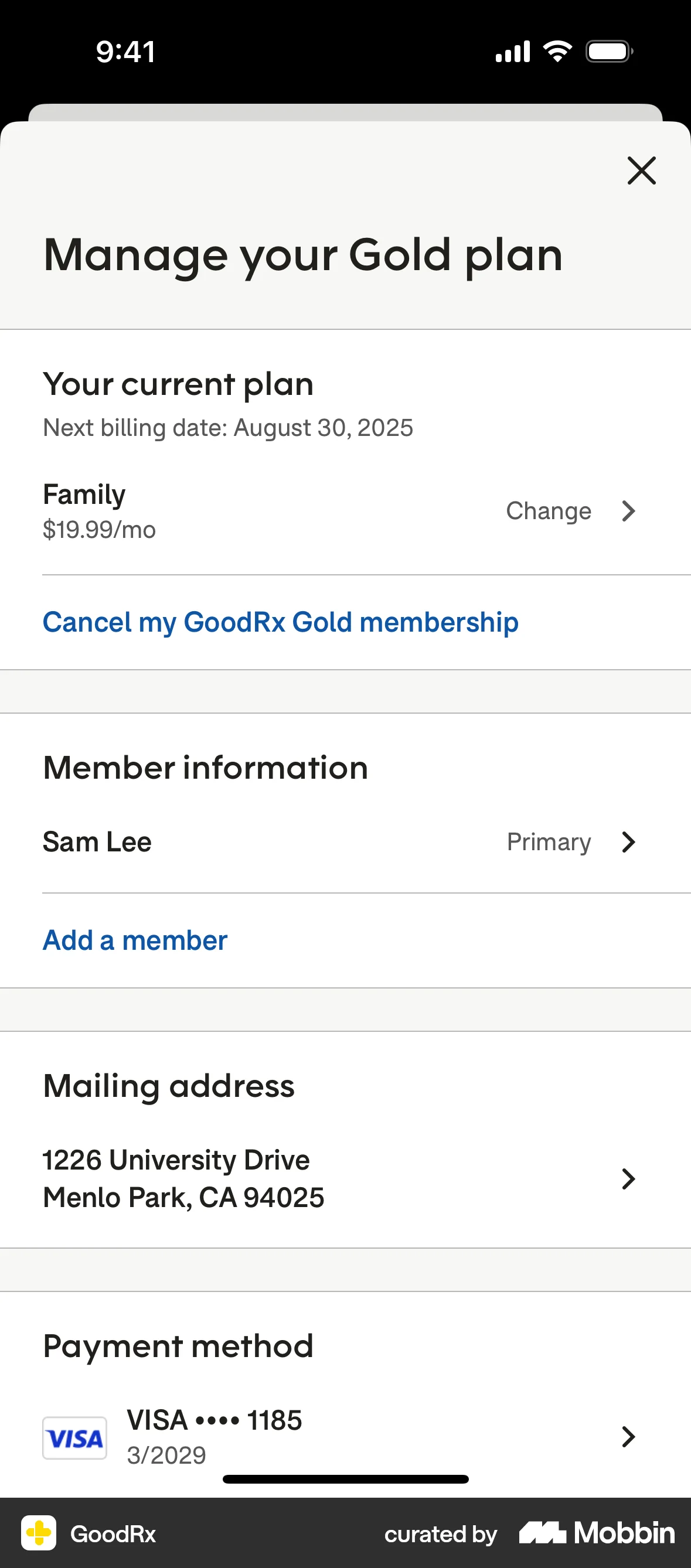
- Give the cancellation or downgrade path the same position treatment as the upgrade: inside the first five rows of the settings list, not the middle of a help article. Reordering a list to make leaving harder is using this entry against the user.
- In a voice or read-aloud flow, say the option you want considered last and keep each option to a few words. Recency dominated for spoken options, and it was strongest where options were complete sentences — the same condition under which users understood least.
What to avoid
- Burying the total price, the contract duration or the termination conditions in the middle of a page. Article 8(2) of Directive 2011/83/EU requires the trader to make the consumer aware “in a clear and prominent manner, and directly before the consumer places his order” of the information in Article 6(1)(a), (e), (o) and (p) — main characteristics, total price, duration and conditions for terminating — and “if the trader has not complied with this subparagraph, the consumer shall not be bound by the contract or order.”
- Collecting card details before the material terms have been stated. In the US, 15 U.S.C. § 8403(1) requires a seller to disclose “all material terms of the transaction” clearly and conspicuously “before obtaining the consumer's billing information,” which fixes the order of your checkout regardless of what converts better.
- Labelling the final action vaguely because the price was explained earlier. The same Article 8(2) requires that the order button be “labelled in an easily legible manner only with the words ‘order with obligation to pay’ or a corresponding unambiguous formulation.”
- Selling a position in a ranked list without saying so. Annex I point 11a of Directive 2005/29/EC makes it a per se unfair practice to provide search results “without clearly disclosing any paid advertisement or payment specifically for achieving higher ranking,” and Article 7(4a) makes the main parameters determining the ranking, and their relative importance, material information that must sit in a section directly accessible from the results page — so keep an audit record of what the list is sorted by and of any paid placement.
- Ordering a list to exploit the fact that the middle is unread — the expensive add-on third from top, the protective setting eleventh. The attention asymmetry is well measured; using it to hide something is the part regulators read as a deceptive pattern.
- Claiming a first-and-last, U-shaped layout. No field study here produces one: vertical lists give a top bias, rows give a centre bias, speech gives a last bias, and a long list simply decays with depth.
- Quoting a position effect as a conversion effect. Under randomisation, rank changed what people clicked and left purchase-conditional-on-click flat, and the position effect looks bigger than it is whenever the list was sorted by quality in the first place.
Real-world examples



Measuring it
- Primary metric: selection share by position, measured against a cell where the order is randomised per user. Any ordering you chose on merit will overstate its own effect, which is the bias the Expedia experiment isolated.
- Secondary: how deep users get. Scroll depth, impressions per position and the share of sessions that interact with anything below the fifth row tell you whether your middle is read at all before you argue about its order.
- Separate attention from preference. Report tap rate by position alongside the completion rate conditional on opening the item; if position moves the first and not the second, you changed what was seen, not what was wanted.
- Backfire metric: comprehension of whatever you moved out of the middle, and of whatever you moved into it. Quiz the renewal date, the price after trial and the cancellation terms rather than inferring understanding from the fact that the flow completed.
- Backfire metric: later surprise — refunds, chargebacks, failed-renewal complaints and “I didn't know” support contacts in the first billing period. An ordering change that lifted conversion and raised these moved the decision without the information.
References
- Murdock (1962). The serial position effect of free recall. Journal of Experimental Psychology.
- Glanzer & Cunitz (1966). Two storage mechanisms in free recall. Journal of Verbal Learning and Verbal Behavior.
- Howard & Kahana (1999). Contextual variability and serial position effects in free recall. Journal of Experimental Psychology: Learning, Memory, and Cognition.
- Joachims, Granka, Pan, Hembrooke & Gay (2005). Accurately interpreting clickthrough data as implicit feedback. Proceedings of SIGIR 2005.
- Ursu (2018). The power of rankings: quantifying the effect of rankings on online consumer search and purchase decisions. Marketing Science; figures cited from the author's University of Chicago dissertation version.
- Ho & Imai (2008). Estimating causal effects of ballot order from a randomized natural experiment: the California alphabet lottery, 1978–2002. Public Opinion Quarterly.
- Holbrook, Krosnick, Moore & Tourangeau (2007). Response order effects in dichotomous categorical questions presented orally: the impact of question and respondent attributes. Public Opinion Quarterly.
- Höhne & Lenzner (2015). Investigating response order effects in web surveys using eye tracking. Psihologija.
- Atalay, Bodur & Rasolofoarison (2012). Shining in the center: central gaze cascade effect on product choice. Journal of Consumer Research.
- Directive 2011/83/EU on consumer rights, Article 8(2) and Article 6(1)(a), (e), (o), (p).
- Directive 2005/29/EC on unfair commercial practices, consolidated text of 28 May 2022, Article 7(4a) and Annex I point 11a.
- Restore Online Shoppers' Confidence Act, 15 U.S.C. § 8403 (2010).
For agents
An agent-friendly guide to this principle lives at /agents/serial-position-effect.md.
Our MCP server and skills for all principles are coming soon.
Similar principles
Disclaimer: The theories here are just that — theories. They may not apply universally and should be considered in context. Use your own judgment and consult additional sources when applying these principles.