Von Restorff effect
Also called the isolation effect. It is a memory finding about free recall from a list, not a law of attention, and von Restorff read it as interference among the crowded items rather than a bonus to the odd one.
Hedwig von Restorff's 1933 dissertation is in German; MacLeod's (2020) history went back to the source. Across nine experiments she gave people lists of paired associates built from a single material — nonsense syllables, numbers, letters, colours — with one or a few pairs isolated against that uniform background, then tested free recall. Isolates were recalled better than the “massed” items whatever the material. Two of her own observations are routinely dropped: recognition tests “yield smaller differences than do tests of reproduction,” and she read the effect as a cost to the crowded items, functionally disadvantaged by belonging to a subgroup, rather than as a bonus to the odd one. The original finding is about remembering a list later, not about what a user notices now.
Hunt's (1995) re-reading is the standard citation for what the effect requires, and it argues against the design slogan. Von Restorff herself presented evidence that perceptual salience is not necessary, and Hunt's point is that difference alone is not sufficient either: distinctiveness is relational, so an item is distinctive only against a background of similar items. Schmidt (1991) had already warned that the concept had been stretched across four classes of phenomena that behave differently, and concluded it was being overapplied. On a screen the work is done by the sameness of everything else, so a highlight dropped into an already-varied layout has nothing to contrast with.
The most careful recent test makes both the effect and its cost visible. Schmidt and Schmidt (2017) ran 15-word lists under free recall. An isolate mid-list was recalled .55 of the time against .43 for the same word in a homogeneous list — a marginal advantage — and against .27 when the whole list was unrelated, which is the uniform background doing the work. Meanwhile the non-isolated items around it fell from .57 to .53. Isolating an item in the second position did not help at all: isolates were recalled .44 against .63 in homogeneous lists, and the impairment replicated both when participants simply read the list and when they named colours while reading it. A cross-category contrast, a word among numbers, still gained early, but a merely conceptual oddity lost. Their conclusion is that “the early isolation effect may be of more limited generality than many researchers have assumed.” Emphasis near the top of a set can cost you the item you emphasised, and part of what the isolate gains comes off its neighbours.
Which kind of difference you use decides whether a distracted user gets anything. Bireta and Mazzei (2016) crossed full and divided attention with physically isolated items — a different colour or typeface — and semantically isolated ones. Under full attention both worked: physical isolates .69 against .47 for controls, semantic isolates .60 against .40. Under divided attention the physical effect survived (.51 against .31) while the semantic effect disappeared entirely (.34 against .35). A colour or weight change is close to automatic; a cleverly worded label is not, and a user glancing at a screen while doing something else is the divided-attention case.
None of that is about looking, and the looking literature is separate and better measured. In Wolfe's (2021) Guided Search model a target defined by one guiding feature such as colour gives a search slope “near (but typically a little greater than) 0 ms/item,” so a single unique element is found in about the same time however many others surround it, whereas serial search runs at roughly 90 to 350 ms per item. But guidance is not the same as salience: bottom-up salience is in Wolfe's account a powerful but short-lived form of guidance, and in real scenes meaning maps predict fixations better than salience maps do. Orquin, Lahm and Stojić (2021) meta-analysed 122 effect sizes from eye-movement studies of decision making and ranked the visual levers: central position ρ = .43, surface size ρ = .35, fewer competing elements ρ = .24, and visual salience last at ρ = .13. Where you put the element and how big you make it buy more looking than how loudly you colour it.
A distinct block on a working page can also be skipped precisely because it is distinct. Burke, Hornof, Nilsen and Gorman (2005) eye-tracked people searching news headlines: participants looked at banners in 11.7% of trials, and at plain grey placeholder rectangles (8.8%) almost as often as at designed static (13.0%) or animated (13.2%) ones. Recognition afterwards was at chance. The ads were not free: commercial banners slowed exact-match search against grey rectangles, flashing text raised perceived workload, and a target sandwiched between two banners took 75% — 4.3 seconds — longer to find. Pagendarm and Schaumburg's (2001) smaller study points the same way: aimless browsers remembered banners significantly better than people sent to find something. Shape a highlight like an ad and the user with a task will miss it and lose time to it.
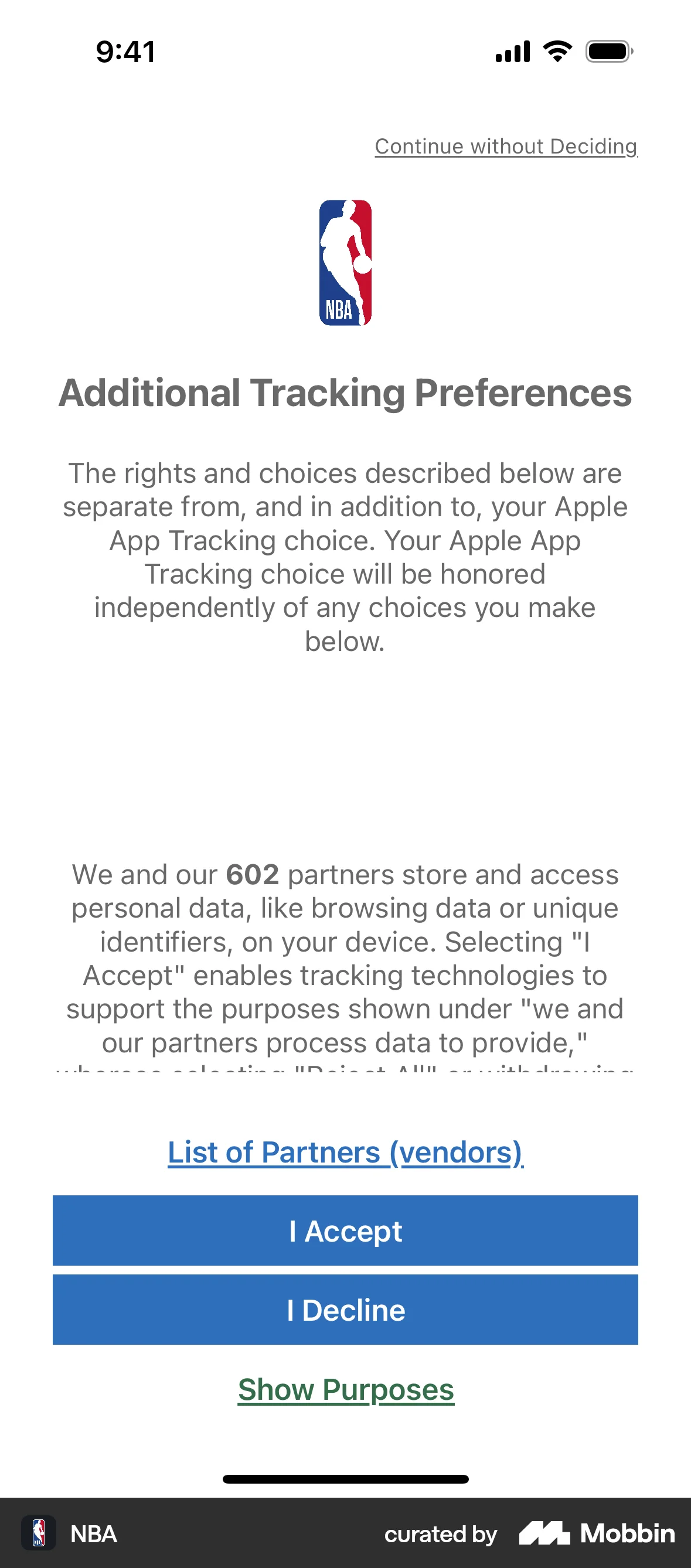
The interface claim that has actually been measured is emphasis on a consent dialog, and it is worth single digits. Utz, Degeling, Fahl, Schaub and Holz (2019) ran notice variants past 82,890 visitors of an e-commerce site; in the confirmation-only notice, “Accept” drawn as a highlighted button was clicked by 50.8% of mobile visitors against 39.2% when the same word was a plain text link (26.9% against 21.1% on desktop). Structure did far more than styling: around 30% of mobile visitors accepted all third parties when the checkboxes came pre-ticked, against under 0.1% when they had to tick them, and Nouwens, Liccardi, Veale, Karger and Kagal (2020) found that notification style — a blocking barrier or a banner — did not affect the consent rate at all, while removing the “reject all” button from the first page raised acceptance by 22.0 and 23.1 percentage points. Emphasis can also run backwards: in Armel, Beaumel and Rangel's (2008) lab task, showing one of two real foods for longer raised its choice share by 6 to 11% for liked or neutral items and lowered it 7% for disliked ones. Nothing in the isolation literature measures choice, no published experiment tests a highlighted pricing tier, and the nearest measured analogue is a consent button worth about ten points on mobile — so treat the highlight as a scarce pointer at one option and measure the selection on your own screen.
When it holds
- One odd item against a uniform background. The isolate was recalled .55 where everything else matched and .27 when the whole list was unrelated, so the similarity of the other items is what makes the odd one distinctive (Hunt 1995; Schmidt & Schmidt 2017).
- Not at the start of the set. An isolate in the second position was recalled .44 against .63 for the same words in a homogeneous list, and the impairment replicated under both plain reading and a distracting secondary task.
- The neighbours pay a little. Non-isolated items in the middle of an isolation list fell from .57 to .53, so the gain is partly redistribution inside the set rather than free.
- Perceptual contrast survives a distracted user; conceptual oddity does not. Under divided attention physical isolation held (.51 against .31) and semantic isolation vanished (.34 against .35).
- Weaker when the test is recognition rather than recall. Von Restorff's own result was that recognition yields smaller differences than reproduction, and a user looking at your screen is recognising, not recalling.
- Salience is the weakest of the visual levers. Across 122 eye-movement effect sizes, central position (ρ = .43), surface size (ρ = .35) and having fewer competing elements (ρ = .24) all beat visual salience (ρ = .13).
- Not if it reads as an ad, and not for a user with a goal. Banners were looked at in 11.7% of trials, grey placeholders nearly as often as designed ones, and recognition was at chance; browsers remembered banners better than searchers did.
- Emphasis is worth single-digit points on a real decision. A highlighted accept button beat the same word as a text link by about 11 points on mobile and 6 on desktop, while removing the alternative was worth 22 to 23.
- It reverses on an option the user does not want. Holding attention on an item raised choice of liked items by 6 to 11% and lowered choice of disliked ones by 7%, so emphasising an unattractive plan pushes people away from it.
How to apply
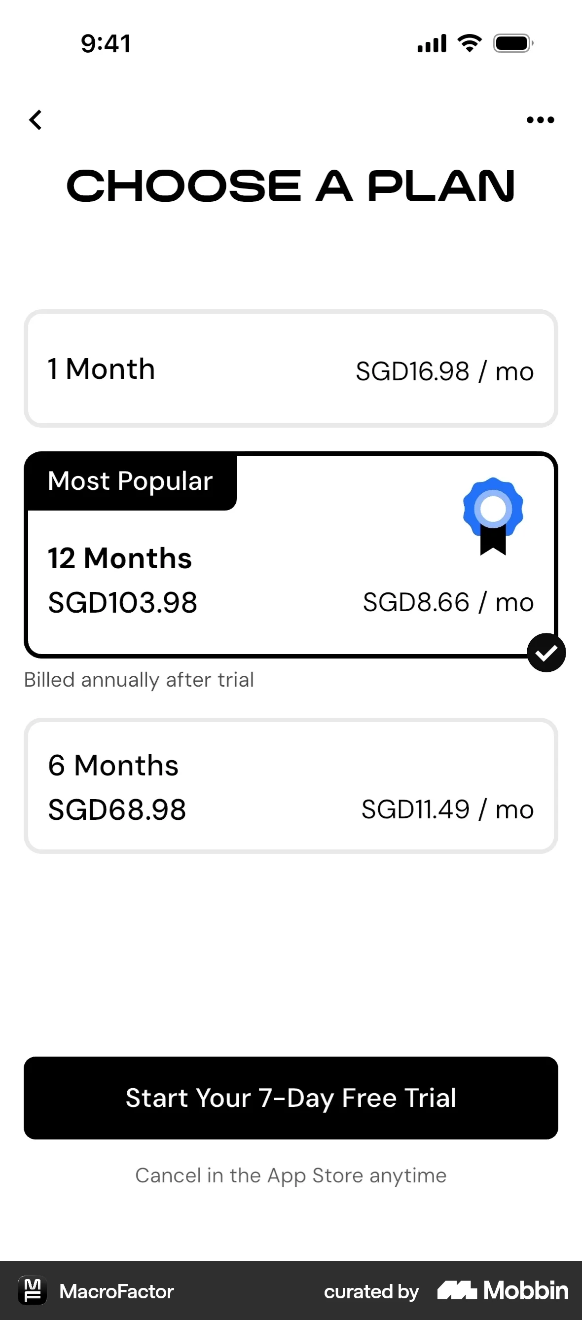
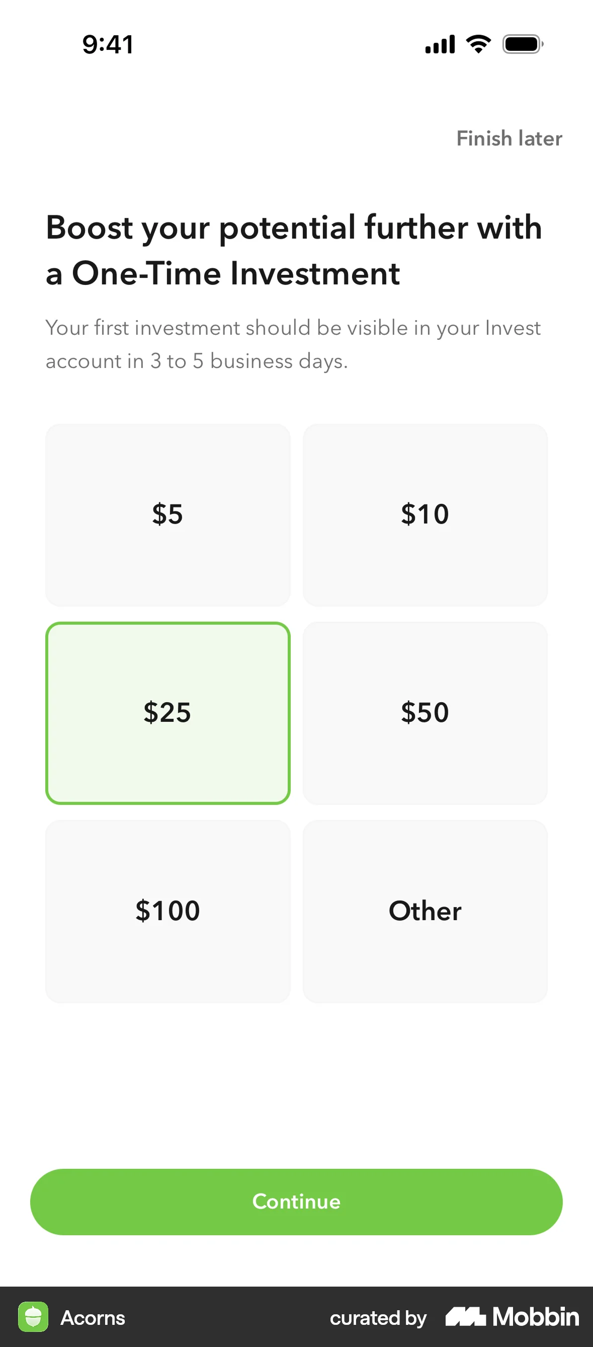
- Make the set uniform first, then break it once: identical card heights, the same attributes in the same order, one badge. The isolate only stands out against sameness, and in a list that already varied it was recalled .27 against .55.
- Place the emphasised option in the middle of the set rather than first. Isolating the second item impaired recall of it in every condition tested.
- Spend position and size before colour. Move the recommended tier to the centre and give it more room instead of adding another accent: central placement and surface area outrank salience in the meta-analytic ranking.
- Carry the distinction perceptually — weight, size, a border, a fill — not only in wording. Physical isolation survived divided attention and a semantically clever label did not, and a glancing user is the divided-attention case.
- Keep the highlight out of banner shape: no banner-proportioned block, no flashing, no animation. Animated banners were recognised no better than chance and still slowed the surrounding task.
- Repeat the emphasis at the moment of the decision rather than relying on it being remembered from an earlier screen. Recognition differences are smaller than recall differences, and 93.1% of pop-up interactions never left the first page.
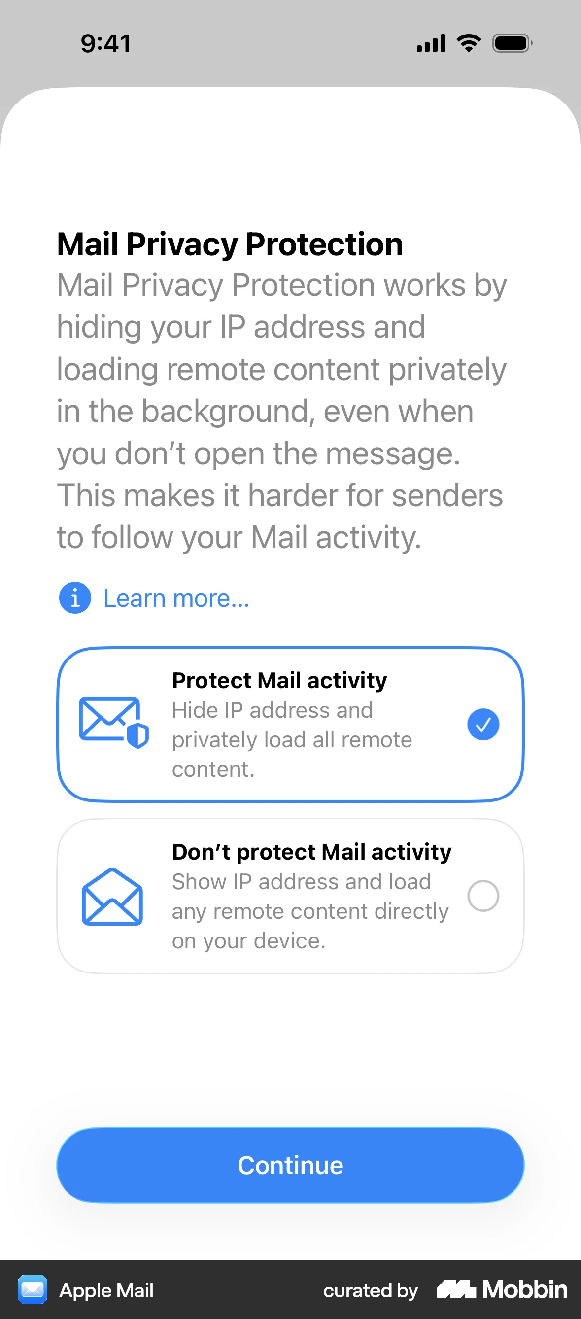
- Point it at the option you would defend out loud — the protective setting, the cheaper plan, the cancellation link. The EDPB names “contrasting data protection elements,” making a privacy control visually striking on a screen that is not about privacy, as good practice.
What to avoid
- A second highlight. Distinctiveness is a budget, which is why this design system spends its one filled action exactly once per view: add a second fill or badge and the set is uniform again, and the measured attention gain from having fewer competing elements (ρ = .24) goes with it.
- Highlighting the option that is worse for the user. The EDPB's deceptive design guidelines accept that “all options on offer” need not look the same, but state that “if controllers decide to highlight one option more than the other(s), the highlighted one needs to be the most restrictive regarding data processing,” tying unequal emphasis to data minimisation in GDPR Article 5(1)(c) and data protection by default in Article 25(2).
- Drawing your path as a button and the user's alternative as a text link, then calling it a styling preference. That exact swap moved clicks by about 11 points on mobile across 82,890 visitors, and in the same guidelines a prominent confirmation beside an overlooked opt-out is the Hidden in plain sight pattern.
- Animation, flashing or motion to force the issue. Flashing text raised perceived workload and a target between two banners took 4.3 seconds longer to find — you buy a cost to the task and no memory benefit.
- Leaning on a highlight to carry something the user will need later: a renewal date, a price after trial, a usage limit. This is a recall effect in a 15-word list, recognition gains are smaller, and the items beside the isolate get slightly worse.
- Quoting von Restorff for a conversion lift. Nothing in the isolation literature measures choice, and the best-measured interface version of emphasis is worth single-digit percentage points.
- Treating this as an attention law. The effect is about memory for a list, it was shown not to require perceptual salience, and in the looking literature salience is the weakest predictor of where the eyes go.
Real-world examples
Measuring it
- Primary metric: share of users selecting the emphasised option, against a control cell where every option is styled identically — not against a cell where the option is missing, which measures removal rather than emphasis. The memory literature does not contain this claim, so until you run it, it is an unmeasured hypothesis.
- Secondary: whether the element is seen at all. First-interaction position, scroll-past rate for the highlighted block, and if you have eye tracking, time to first fixation; a highlight nobody looks at is the banner-blindness failure, not a weak effect.
- Backfire metric: comprehension and uptake of the options you did not highlight. Watch selection of the other tiers, questions about what they include and support contacts naming a feature the unhighlighted plan has — that is the neighbour cost showing up in your funnel.
- Backfire metric: later surprise — refunds, downgrades, chargebacks and “I didn't know” contacts in the first billing period. Emphasis that moved a click without being understood shows up here rather than in the conversion number.
- If the highlight is on a consent or settings screen, report the protective option's share alongside the accepting one and keep the pair in the record. An emphasis change that moves that ratio is a compliance question, not an experiment result.
References
- MacLeod (2020). Zeigarnik and von Restorff: The memory effects and the stories behind them. Memory & Cognition.
- Hunt (1995). The subtlety of distinctiveness: What von Restorff really did. Psychonomic Bulletin & Review.
- Schmidt (1991). Can we have a distinctive theory of memory? Memory & Cognition.
- Schmidt & Schmidt (2017). Revisiting von Restorff's early isolation effect. Memory & Cognition.
- Bireta & Mazzei (2016). Does the isolation effect require attention? Memory & Cognition.
- Wolfe (2021). Guided Search 6.0: An updated model of visual search. Psychonomic Bulletin & Review.
- Orquin, Lahm & Stojić (2021). The visual environment and attention in decision making. Psychological Bulletin.
- Burke, Hornof, Nilsen & Gorman (2005). High-cost banner blindness: Ads increase perceived workload, hinder visual search, and are forgotten. ACM Transactions on Computer-Human Interaction.
- Pagendarm & Schaumburg (2001). Why are users banner-blind? The impact of navigation style on the perception of web banners. Journal of Digital Information.
- Utz, Degeling, Fahl, Schaub & Holz (2019). (Un)informed Consent: Studying GDPR Consent Notices in the Field. Proceedings of the 2019 ACM SIGSAC Conference on Computer and Communications Security.
- Nouwens, Liccardi, Veale, Karger & Kagal (2020). Dark Patterns after the GDPR: Scraping Consent Pop-ups and Demonstrating their Influence. Proceedings of CHI 2020.
- Armel, Beaumel & Rangel (2008). Biasing simple choices by manipulating relative visual attention. Judgment and Decision Making.
- EDPB (2023). Guidelines 03/2022 on deceptive design patterns in social media platform interfaces, version 2.0, Annex I items 4.2.1 and 4.3.2 and Annex II best practices.
For agents
An agent-friendly guide to this principle lives at /agents/von-restorff-effect.md.
Our MCP server and skills for all principles are coming soon.
Similar principles
Disclaimer: The theories here are just that — theories. They may not apply universally and should be considered in context. Use your own judgment and consult additional sources when applying these principles.