Foot-in-the-door
Foot-in-the-door is the claim that a small yes makes the next, larger ask easier. The interface sequences built on it are real — staged forms, progressive sign-up, a deferred account — but the compliance mechanism is the weakest part.
0The compliance mechanism is close to a dead end, and the evidence for that is old and consistent. Beaman, Cole, Preston, Klentz and Steblay (1983) pooled 120 experimental groups and called the phenomenon replicable but weak, with nearly half producing no effect or an effect in the wrong direction. Burger's (1999) review reads that record as several processes pulling in opposite directions at once — self-perception, reactance, conformity, commitment — so the same manipulation sometimes raises compliance and sometimes lowers it. Gamian-Wilk and Doliński's (2020) direct replication of the original procedure worked in Ukraine and not in Poland in 2003, and was insignificant in both countries in 2013; the effect size Freedman and Fraser reported has never been obtained again. The moderators sit under commitment and consistency. Plan a request sequence as if the compliance gain were zero, and justify it on the grounds below.
The only field test of the sequence delivered as an interface is one paper. Guéguen and Jacob (2001) solicited 1,008 people drawn at random from e-mail lists to visit a humanitarian website, with the manipulation implemented purely as the order of successive HTML pages: a petition to sign and then the donation ask, against the donation ask alone. They report that the sequence raised compliance with the final request, but the published abstract carries no condition-level rates. One study, 25 years old, with no preregistered web replication since — that is the whole direct evidence that progressive sign-up works as a compliance technique.
What does move reliably is the cost the user can see before starting. Galešić and Bošnjak (2009) varied the stated length of a web questionnaire between 10, 20 and 30 minutes: the longer the stated length, the fewer respondents started and completed it, reported as a direction with no percentages. Sandelin (2022) randomised 8,000 Gothenburg residents to a 205-question or a 149-question mixed-mode survey, and the longer instrument cut the response rate to 45.8% from 48.5%. The split by mode is the part to build on: on paper, where the bulk is visible, the longer version lost 2.8 percentage points (34.7% against 37.5%); online, where length is invisible, there was no difference at all (11.1% against 11.0%, not significant). Perceived bulk deters and invisible bulk does not: the argument for a small first step, and the warning that making a long task look short is not the same as making it short.
The claim that chunking an ask into pages improves completion has a null at its centre. Mavletova and Couper's (2015) meta-analysis of breakoff in mobile web surveys — 14 studies, 39 independent samples — found that shorter surveys, mobile optimisation, prerecruitment, reminders and a less complex design all reduced breakoff, while a scrolling design, incentives, stating the expected duration in the invitation and letting respondents skip questions did not. Paging against scrolling is the survey-methodology name for a multi-step form against one long one, and it sits in the no-effect column. Toepoel, Das and van Soest (2009) split the same 40-question instrument across 1, 4, 10 and 40 items per screen: item nonresponse rose as items per screen rose, while more items per screen shortened the interview and worsened how respondents rated the layout. Fewer fields per screen buys answer completeness and costs time; it does not buy completion.
The steps after the first one decide the outcome. Peytchev (2009) found that features visible only after a survey starts predict breakoff, and that respondents who broke off did not look inattentive — they met something specific and stopped. Villar, Callegaro and Yang's (2013) meta-analysis of 32 randomised progress-indicator experiments points the same way: a constant indicator did not significantly reduce drop-off, indicators that moved fast early and slowly later did reduce it, indicators that started slowly increased it, and where a small incentive was promised a constant indicator made drop-off worse. A step counter is not a motivator; it is a statement about how much is left, and it is read as one.
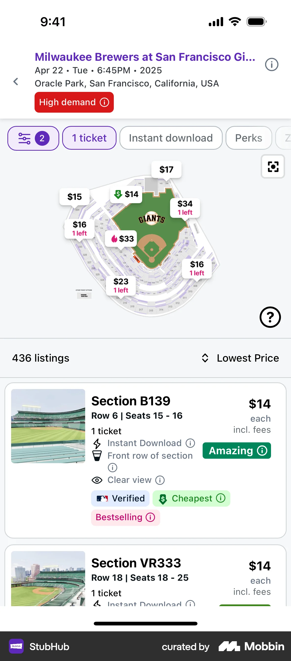
One version of the sequence does raise conversion, and it is the anti-pattern. Cialdini, Cacioppo, Bassett and Miller (1978) named it the low-ball: securing an initial decision and then making performance more costly produced greater final compliance than disclosing the full cost from the outset, and only where the first decision was made with a high degree of choice. Blake, Moshary, Sweeney and Tadelis (2018) measured the same shape at scale on StubHub, splitting several million users over ten days between fee-inclusive prices and base prices with the roughly 15% buyer fee added at checkout. Shrouding the fee raised ten-day revenue per user by 20.64%, the transaction rate by 14.1% and the price of the ticket actually bought by 5.42%; shrouded users were about 19% more likely to select a ticket and then about 45% less likely to buy once the total appeared. The one reliably converting version of this sequence is the deceptive one, and it held for experienced buyers too (15.09% on revenue for people with ten or more prior visits), so it is not a trick users learn their way out of — and in the EU and the US it is now substantially unlawful on the surfaces where it was most common.
The honest grade is weak. The mechanism cited for sequencing asks has a meta-analysis calling it weak, a null direct replication and one unreplicated online study; the interface version — split the form, raise completion — has a null in the one meta-analysis that tests it. What survives is that visible cost deters starting, that what people meet after starting decides finishing, and that deferring the real cost works by surprise. Build a sequence to cut what the user must evaluate at each step and to let them leave with their work saved, and do not expect the first yes to carry the second.
When it holds
- Not from the sequence itself. Splitting content across pages rather than one scrollable page sits in the no-effect column of a 14-study, 39-sample meta-analysis of breakoff, alongside incentives and stating expected duration.
- Where the first screen implies a small total. Announced lengths of 10, 20 and 30 minutes produced progressively fewer starts, and a 205-question paper survey lost 2.8 percentage points against a 149-question one — but the same comparison online, where the length is invisible, produced no difference at all.
- Where each step is small enough to answer. Item nonresponse rose with the number of items on a screen, so one ask per screen improves the answers you get even where it does not improve completion.
- Where the sequence is short enough that the last steps still get real answers. Answers positioned later in a questionnaire were faster, shorter and more uniform than the same answers positioned early.
- Where the step counter front-loads. Progress indicators that moved fast early and slowly later reduced drop-off; indicators that started slowly increased it; a constant indicator did nothing, and made things worse when a small reward was promised.
- Where the worst step is good. Features visible only after starting predict breakoff, and people who broke off did not look inattentive — they hit something specific and left.
- Where the compliance claim is made at all, it needs the first step to be voluntary and actually performed; the moderators and odds ratios sit under commitment and consistency. Half of the pooled studies found nothing or the reverse, and the one direct replication was null in both countries by 2013.
- It reverses when the thing you deferred is the price. Shrouding a 15% fee made users 19% more likely to select a ticket and then about 45% less likely to buy at checkout — a sequence that converts at the top by losing people at the reveal.
How to apply
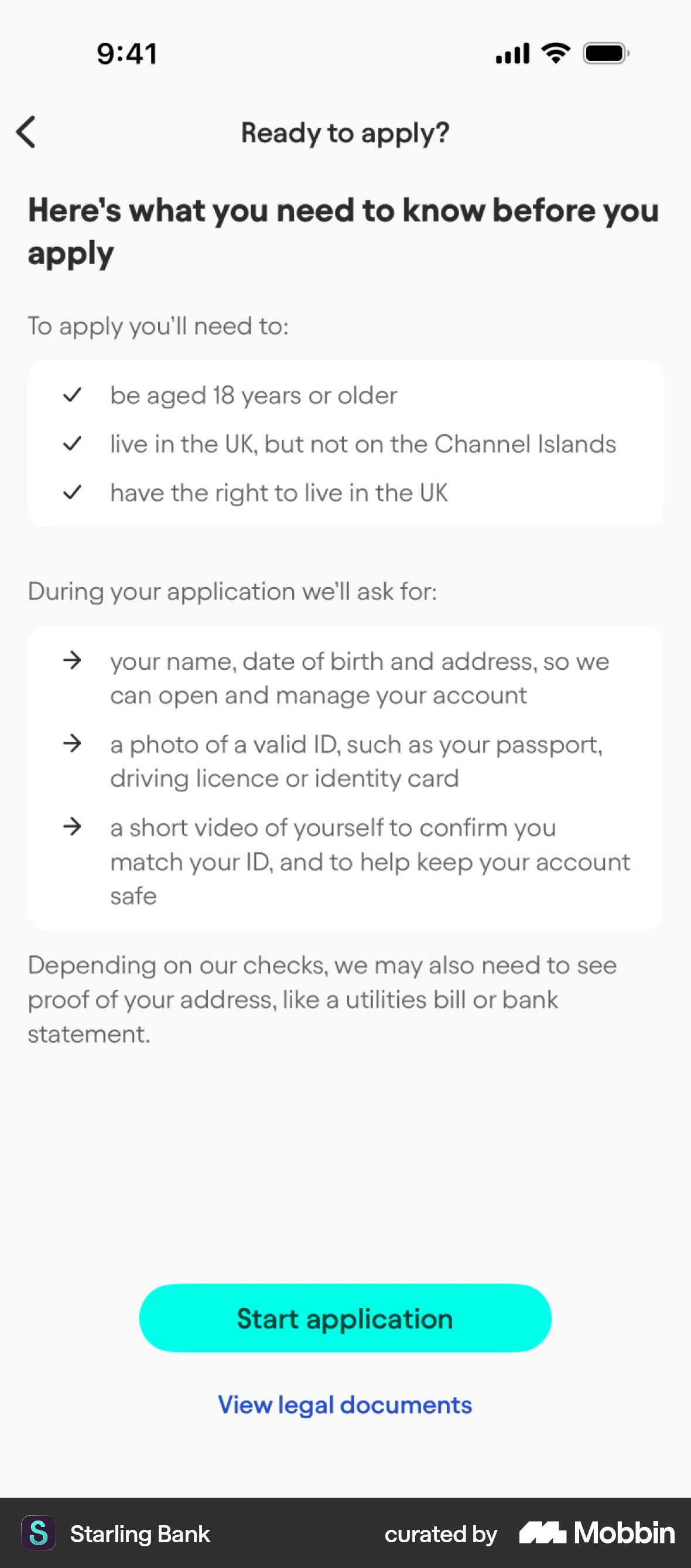
- Make the first screen do something the user came for — a search, a calculation, a configured plan — and ask for identity only once there is something to attach it to. A deferred sign-up starts the sequence with output instead of a form.
- Put one ask per screen where the ask needs thought, and keep the screens few. More items per screen raised item nonresponse, so one question at a time buys usable answers rather than clicks.
- Say where the sequence ends on the screen where it begins: how many steps, roughly how long, and what the last step asks for (card, ID document, bank connection). Breakoff is driven by what people discover after starting, so remove the discovery.
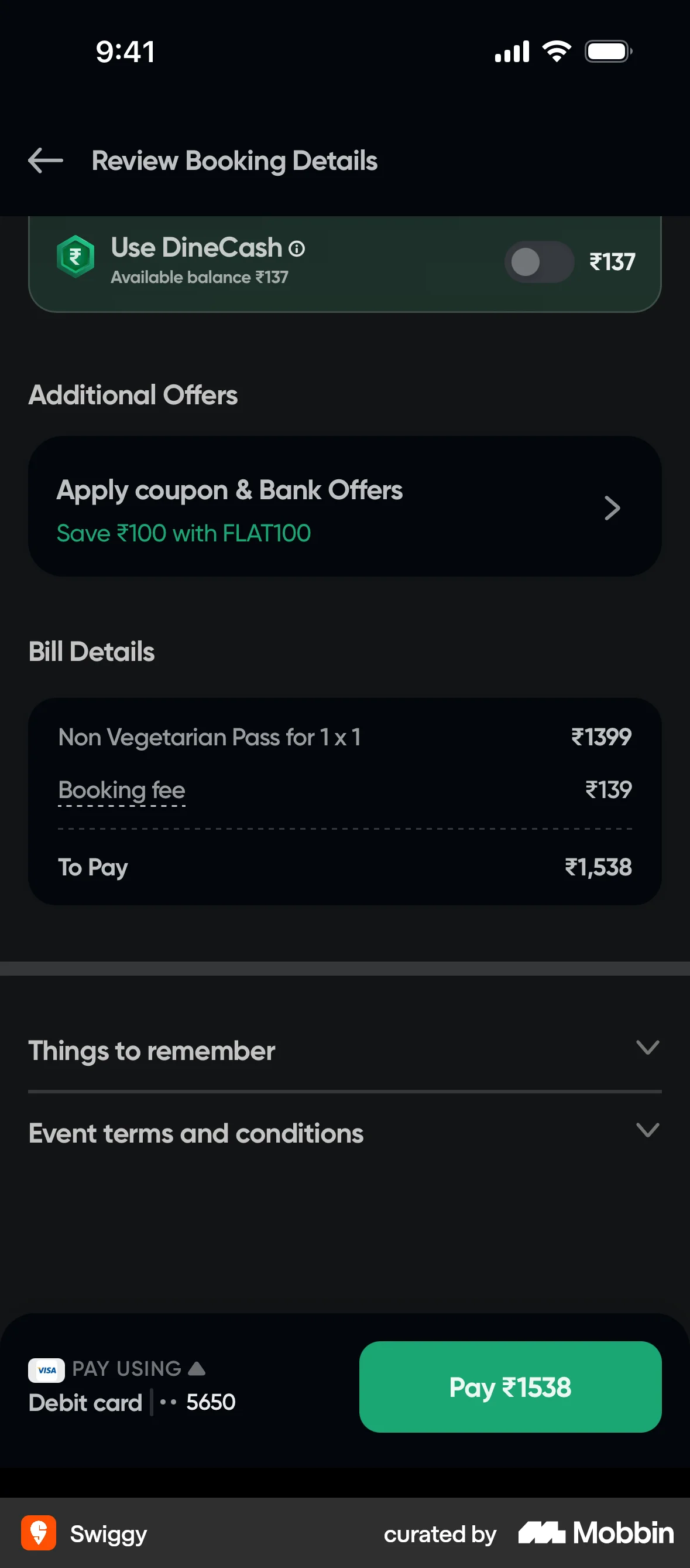
- Show the total price, including fees and tax, the first time any price appears — not on the final step. Deferring it moves people deeper and then loses nearly half of them at the reveal.
- Order steps so the quick ones come first if you display a step counter at all. Front-loaded progress was the only indicator shape that reduced drop-off; a counter that crawls through step one is worse than none.
- Persist each step server-side as it completes, and let the user return to the step they left. Partial capture is the one thing a staged flow reliably gains over a single long form, and it comes from the implementation rather than from any psychological effect.
- Keep every step's purpose the same as the one the user agreed to. If an email captured for a product update later feeds sales outreach, GDPR Article 13(1)(c) requires that purpose to be stated when the address is collected, not when it is used.
- Do not build a larger follow-up ask on an abandoned step. A user who left at step two is lost rather than warmed up: there is no reliable residual compliance from the first small yes to collect later.
What to avoid
- Hiding the real ask behind innocuous steps. That is the low-ball, and it works: an initial decision followed by an increase in cost produced greater final compliance than full disclosure up front, and on StubHub it raised revenue per user by about 21% while almost halving the purchase rate at the moment the total appeared.
- Drip pricing in regulated categories. The FTC's Rule on Unfair or Deceptive Fees (16 CFR part 464, 90 FR 2066, effective 12 May 2025) makes it an unfair and deceptive practice to offer, display or advertise a price for live-event tickets or short-term lodging without clearly, conspicuously and prominently disclosing the total price, and requires certain disclosures before a consumer consents to pay.
- A final step whose button does not say what it does. Under Article 8(2) of the Consumer Rights Directive 2011/83/EU the trader must make the consumer aware, clearly and prominently and directly before the order, of the main characteristics, the total price and the contract's duration and termination conditions, and the order button must be labelled only with “order with obligation to pay” or an unambiguous equivalent — otherwise the consumer is not bound by the order.
- Splitting a form into steps while keeping every field. Paging against scrolling had no effect on breakoff, so the only measurable change is the extra taps and the extra chance of a timeout.
- Putting the questions that serve only you at the front, on the theory that the user is not invested yet. The first screens are where perceived cost is set, and the people they filter out never see the rest of the product.
- Quoting vendor case studies as evidence. The 59% and 86% lifts attached to multi-step forms have no controlled comparison behind them, and the survey-methodology literature that does run the comparison finds nothing.
- Escalating the ask inside a single session on the assumption the previous step bought you something. The weakest cell in the compliance literature is the same requester asking again immediately, and about half of those studies went the other way.
Real-world examples


Measuring it
- Primary metric: completion of the whole sequence per cohort, with the staged and single-screen arms asking for exactly the same fields and the same total commitment. If the arms differ in what is being asked, the test measures the ask, not the sequence.
- Secondary: drop-off per step, so you can name the worst one. Breakoff concentrates at specific features people meet after starting, which means it has an address.
- Backfire metric: conversion at the step where price or obligation first appears, against entries into the flow. The shrouded-fee signature is more selections at the top and a collapse at the reveal, and a funnel-top dashboard reads that as a win.
- Backfire metric: refunds, chargebacks, cancellations and support contacts mentioning unexpected cost. That is where a low-balled sequence shows up, a billing cycle later than the conversion it produced.
- Backfire metric: unsubscribes and consent withdrawals on identifiers captured in the first step. An address collected before the user knows what the sequence is for is the one most likely to be withdrawn.
References
- Beaman, Cole, Preston, Klentz & Steblay (1983). Fifteen Years of Foot-in-the-Door Research: A Meta-Analysis. Personality and Social Psychology Bulletin.
- Burger (1999). The Foot-in-the-Door Compliance Procedure: A Multiple-Process Analysis and Review. Personality and Social Psychology Review.
- Gamian-Wilk & Doliński (2020). The Foot-in-the-Door Phenomenon 40 and 50 Years Later: A Direct Replication of the Original Freedman and Fraser Study in Poland and in Ukraine. Psychological Reports.
- Guéguen & Jacob (2001). Fund-Raising on the Web: The Effect of an Electronic Foot-in-the-Door on Donation. CyberPsychology & Behavior.
- Galešić & Bošnjak (2009). Effects of Questionnaire Length on Participation and Indicators of Response Quality in a Web Survey. Public Opinion Quarterly.
- Sandelin (2022). The Effects of Questionnaire Length on Response Rate, Non-Response Bias, and Data Quality. SOM Institute Notes on Survey Methodology 2022:1, University of Gothenburg.
- Mavletova & Couper (2015). A Meta-Analysis of Breakoff Rates in Mobile Web Surveys. In Toninelli et al. (eds.), Mobile Research Methods. Ubiquity Press.
- Toepoel, Das & van Soest (2009). Design of Web Questionnaires: The Effects of the Number of Items per Screen. Field Methods.
- Peytchev (2009). Survey Breakoff. Public Opinion Quarterly.
- Villar, Callegaro & Yang (2013). Where Am I? A Meta-Analysis of Experiments on the Effects of Progress Indicators for Web Surveys. Social Science Computer Review.
- Cialdini, Cacioppo, Bassett & Miller (1978). Low-Ball Procedure for Producing Compliance: Commitment Then Cost. Journal of Personality and Social Psychology.
- Blake, Moshary, Sweeney & Tadelis (2018). Price Salience and Product Choice. NBER Working Paper 25186; published in Marketing Science (2021).
- FTC Rule on Unfair or Deceptive Fees, 16 CFR part 464 (90 FR 2066, 10 January 2025, effective 12 May 2025): total price must be disclosed clearly, conspicuously and prominently.
- Directive 2011/83/EU on consumer rights, Article 8(2): total price directly before the order, and an order button labelled only “order with obligation to pay”.
- Regulation (EU) 2016/679 (GDPR), Article 13(1)(c): the purposes of processing must be given when the data are collected.
For agents
An agent-friendly guide to this principle lives at /agents/foot-in-the-door.md.
Our MCP server and skills for all principles are coming soon.
Similar principles
Disclaimer: The theories here are just that — theories. They may not apply universally and should be considered in context. Use your own judgment and consult additional sources when applying these principles.