Banner blindness
When people are working towards a goal, they stop sampling the regions of a page that have never helped them finish it. The skipping is learned from position and task, not from how commercial the thing looks.
The name comes from Benway (1998), and her “banners” were not advertising: they were large, deliberately highlighted links to the very information participants had been asked to find, and they were missed anyway. Geometry and task predicted the misses. Banners placed higher on the page and further from the other links were missed more often than banners lower and closer to them, they were missed more often on pages listing categories than on pages listing specific items, and users “saw banners hardly at all when clicking a banner was not required to accomplish a task”. The user who most wants the highlighted information is the one least likely to find it.
Task orientation is the clearest moderator. Pagendarm and Schaumburg (2001) ran the same banner-carrying site under browsing and searching instructions, then tested memory. Aimless browsers reproduced a mean of 1.00 advertised companies, products or services against 0.06 for the goal-directed searchers, and 1.87 against 0.63 pictorial motifs and colours. Same page, same banners: whether the user is mid-task decides whether the message is retained at all.
Position, not styling, is the variable you can move. Burke, Hornof, Nilsen and Gorman (2005) eye-tracked participants searching headline layouts: banners were fixated in 11.7% of trials at a rate that did not depend on appearance, with plain gray placeholder rectangles drawing gazes in 8.8% of trials, static commercial banners in 13.0% and animated ones in 13.2%, p = .29. Predictability mattered instead — the banner pinned to a fixed slot at the top of the screen was fixated significantly less often than the same banner dropped into a random row inside the content, p = .02. Resnick and Albert (2014) found blindness strongest for banners in the right rail and under goal-directed tasks, with neither rated visual appeal nor page familiarity explaining it. On search pages, Schultheiß and Lewandowski (2021) tracked 100 people over 2,000 tasks: the first labelled text ad above the organic results took 24.2% of desktop fixations and 32.4% on a smartphone, while the same kind of ad at the foot of the page drew 2.5–8.6% and was clicked zero times. Ads took 25% of desktop and 29% of smartphone clicks on navigational tasks, falling to 3–4% on informational ones.
Fixation and memory come apart in both directions, so pick your measure deliberately. In Burke's study recognition was at chance — a 20.1% hit rate against a 20.2% false-alarm rate — and 93.9% of the banners participants did correctly recognise had never received a direct gaze. Hervet, Guérard, Tremblay and Chtourou (2011) note that the avoidance conclusion rested “mostly on indirect evidence that participants do not remember the ad content”, and found most participants fixated the ads at least once per visit. Simonetti and Bigne (2024) put three banners in the content column of a news page: while reading a story, 93% of 100 participants looked at all three yet gave them 5.5% of their dwell time, and in a “find where to click next” task only 55% looked at all three but ad dwell share rose to 11.9%. The eye lands; it just does not stay, and neither impressions nor gaze tells you a message landed.
Turning up the volume does not reverse it and costs the host task. Static banners in Burke's study were remembered above chance (d′ = .667) while animated look-alikes were not (d′ = −.07). Commercial banners slowed easy search by roughly 6–7% against gray rectangles (2,169 ms static and 2,193 ms animated against 2,040 ms) and not at all on a harder semantic task, but banners of flashing cyan text raised measured workload and a target sandwiched between two of them took 75% — about 4.3 seconds — longer to find. Sapronov and Gorbunova (2022) varied banner arousal and valence in goal-directed search and changed nothing: 28 and 29 of 40 participants reported seeing high- and low-arousal banners, the counts across positive, neutral and negative banners were 31, 32 and 29, and neutral banners were recognised better than emotional ones.
Being skipped is not the same as having no effect. Drèze and Hussherr (2003) confirmed that surfers avoid looking at banners — their reason for calling click-through the wrong metric — and still found repetition moving unaided recall, brand recognition and brand awareness. Lewis and Reiley randomised 1,577,256 matched retail customers on Yahoo!: click-through was 0.28% and only 7.2% of treated users ever clicked, yet sales rose by R$0.166 per treated person over three weeks, 93% of it in physical stores, and non-clickers accounted for 78% of the total effect. An element nobody reports seeing can still be working.
Two limits. Every interface study here is lab work with 24 to 120 participants on mock pages built around 2000s layouts of top bars and right rails, and the measures disagree — chance-level recognition in one study, 93% of readers fixating every banner in another. And nothing here shows that looking commercial is what gets an element skipped: the condition skipped just as thoroughly was a plain gray rectangle in the same slot. No study in this literature tested the advice teams draw from the principle, that a genuine product notice styled like a promo will be missed. Treat that as a hypothesis for your own instrumentation; the supported moves are positional and static.
The anti-pattern is regulated, not merely rude. The FTC's Native Advertising: A Guide for Businesses treats a format as deceptive where it materially misleads about the commercial nature of the content, wants the disclosure in front of or above the headline in wording such as “Ad” or “Paid advertisement” rather than “Promoted”, and says company logos and names alone are not likely adequate. In the UK, paragraph 12 of Schedule 20 of the Digital Markets, Competition and Consumers Act 2024, in force 6 April 2025, makes undisclosed paid-for editorial content unfair in all circumstances, with no deception test to argue about.
When it holds
- It holds under goal-directed work and largely dissolves under browsing. Aimless browsers recalled a mean of 1.00 advertised companies or products against 0.06 for goal-directed searchers on the same site (Pagendarm & Schaumburg 2001).
- It attaches to a predictable location, not to commercial styling. Gray placeholder rectangles were fixated in 8.8% of trials against 13.0% static and 13.2% animated commercial banners, p = .29, while the fixed top slot was skipped more than a banner dropped into a random content row, p = .02 (Burke et al. 2005).
- It is weaker inside the content column and above the fold. Reading a story, 93% of participants looked at all three in-content banners with the middle one holding the most dwell time (Simonetti & Bigne 2024); the first ad above organic results took 24.2% of desktop fixations and 32.4% on a smartphone, against 2.5–8.6% and no clicks for the same ad at the foot of the page (Schultheiß & Lewandowski 2021).
- It is strongest in a right rail and under a goal. Neither rated visual appeal nor page familiarity explained the effect (Resnick & Albert 2014).
- Fixation and memory diverge, so pick your measure deliberately. Recognition was at chance — 20.1% hits against 20.2% false alarms — and 93.9% of correctly recognised banners had never been looked at directly (Burke et al. 2005), while most participants fixated ads at least once per visit (Hervet et al. 2011).
- Animation and emotional intensity do not break through. Animated banners were remembered at chance while static look-alikes were not (d′ = −.07 vs .667), flashing banners raised measured workload, and neither arousal nor valence changed whether participants reported seeing banners (Burke et al. 2005; Sapronov & Gorbunova 2022).
- The cost to the surrounding task is small until the element is loud. Commercial banners slowed easy search by about 6–7% against gray rectangles and not at all on a harder task, but a target between two flashing banners took 75% longer to find (Burke et al. 2005).
- Being skipped is not the same as having no effect. With 0.28% click-through and only 7.2% of users ever clicking, display ads still raised sales, and non-clickers produced 78% of that lift (Lewis & Reiley 2014).
- A label does not restore attention. Low ad-knowledge participants clicked labelled search ads more than high-knowledge ones (r = −.196) while fixating them no less (Schultheiß & Lewandowski 2021), and disclosure wording and position changed native-ad recognition, not the fact that recognition had to be designed for (Wojdynski & Evans 2016).
How to apply
- Put anything the user must act on in the content column, in the reading order of the object it concerns — not in a top bar, a right rail or a floating strip. Those are the slots with the measured skip rates.
- Attach the message to the row, record, field or step it is about rather than to a fixed chrome slot. The banner in the same place every time is learned and skipped; the one in an unpredictable content row was fixated more.
- Style inline messaging as content: the surrounding type scale and container width, a hairline border instead of a promo fill, no badge, no full-bleed artwork, no gradient.
- Keep it static. Animation bought no recall in any condition tested and flashing raised workload and search time, so a notice should change state once and then hold still.
- Block rather than annotate when the consequence is real: a disabled primary action with the reason attached to it, inline validation at the field, or a dialog. Something placed beside a flow gets walked past.
- Carry the state in the object as well as in the copy — a flagged row, a changed label, a disabled control, an amended total — so a user who never reads the message still cannot miss the condition.
- Schedule low-stakes announcements for the moments when the user has no goal: empty states, the screen after a task completes, the end of a flow. That is where recall was an order of magnitude higher.
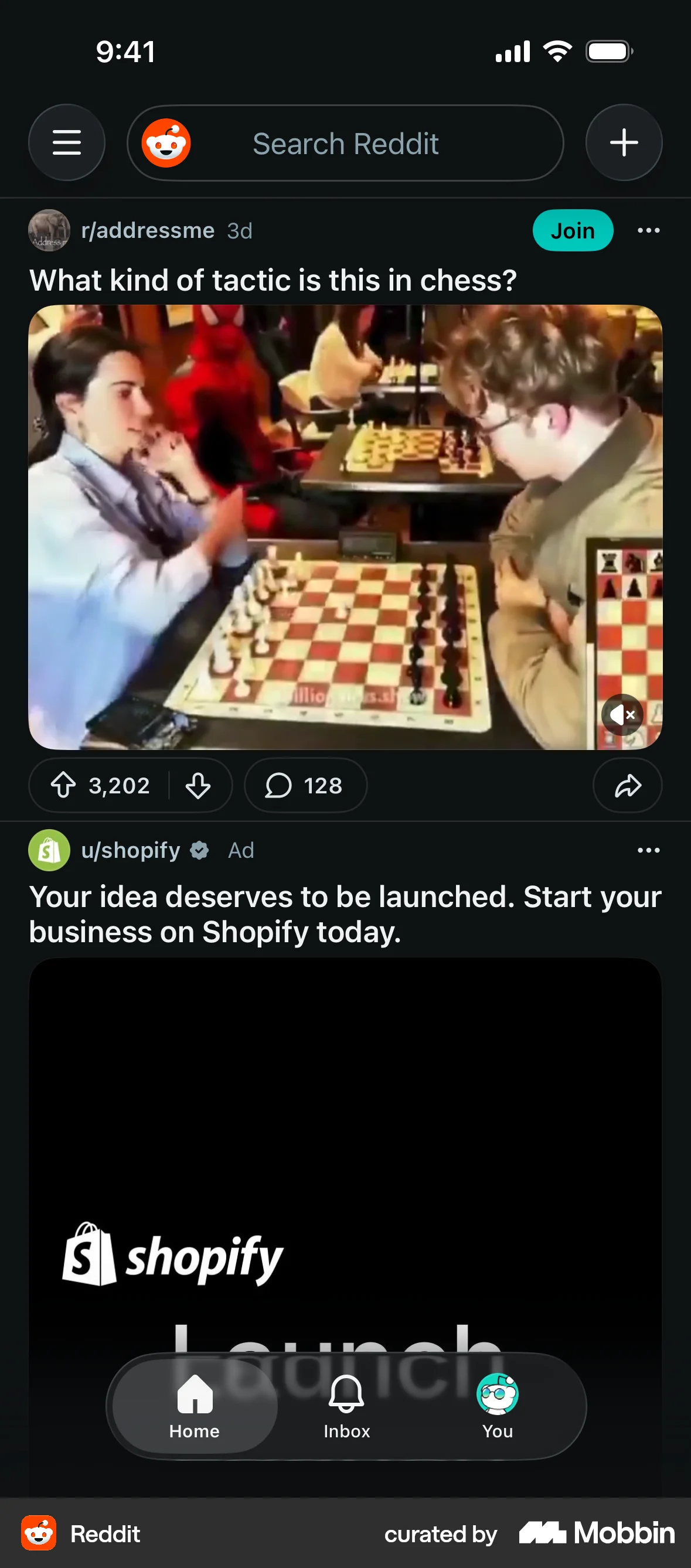
- Label real advertising, sponsorship and paid placement with “Ad”, “Advertisement” or “Sponsored” above the headline in the user's language, not a logo, a brand colour or “Promoted”.
What to avoid
- Formatting an ad, a paid placement or a sponsored post as editorial or as organic product content. The FTC treats the format itself as deceptive where it materially misleads about commercial nature, and paragraph 12 of Schedule 20 of the UK's Digital Markets, Competition and Consumers Act 2024 — in force 6 April 2025 — makes undisclosed paid-for editorial content unfair in all circumstances.
- Relying on a logo, a brand colour or a vague word as the disclosure. FTC guidance says names and logos alone are not likely adequate and warns against ambiguous terms such as “Promoted”.
- Treating “it looks like an ad” as the diagnosis and a restyle as the cure. The control skipped just as often was a plain gray rectangle in the same position; move the element before you redecorate it.
- Turning up the volume — animation, flashing, autoplay, a louder colour. It improved recall in no condition tested, and the loudest condition cost 4.3 seconds on the task the user actually came for.
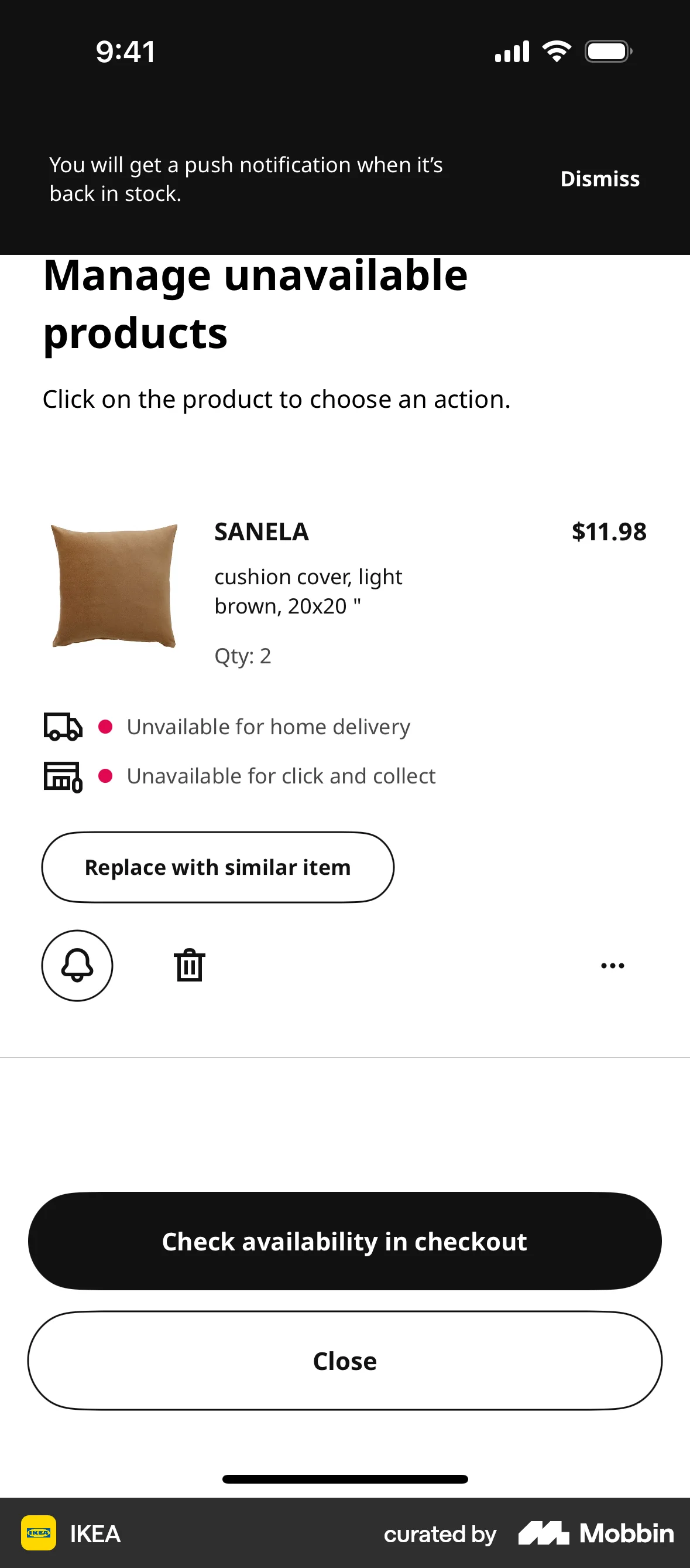
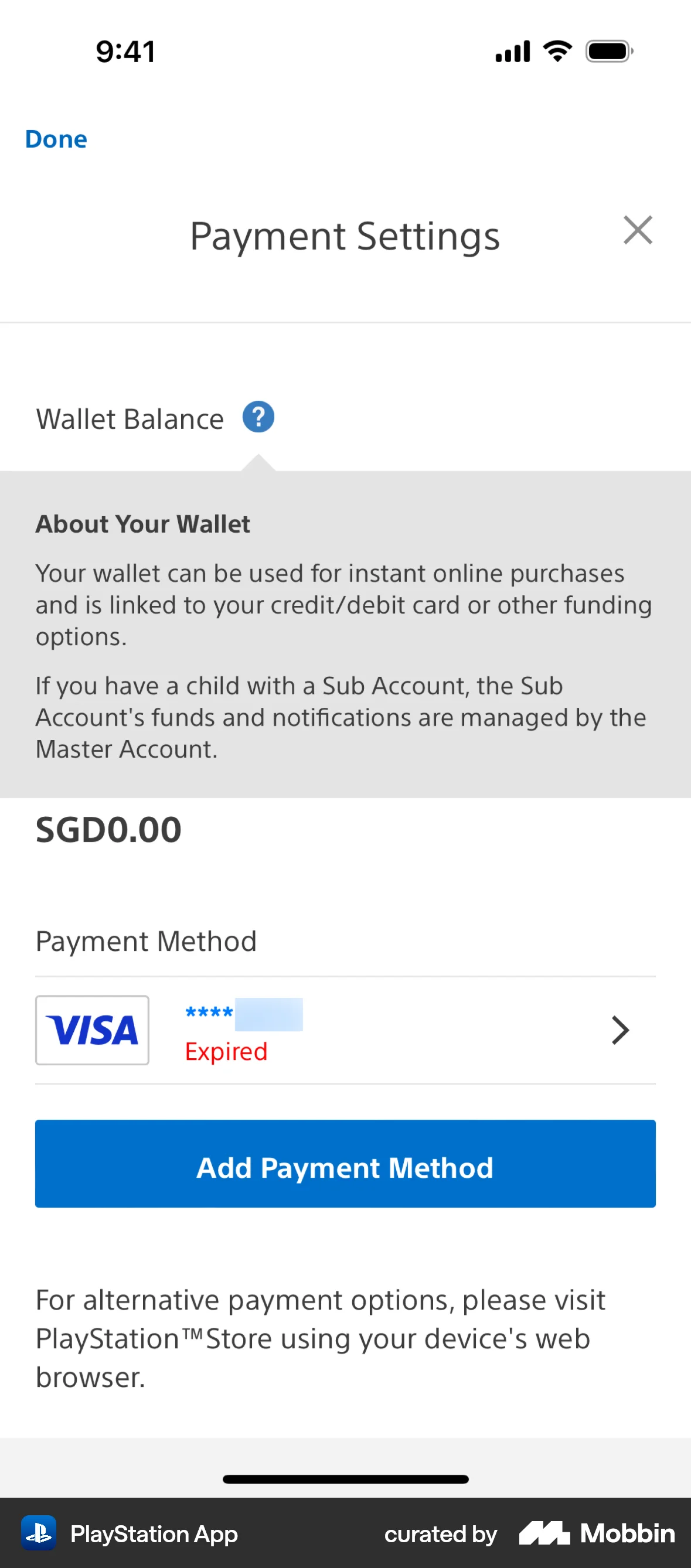
- Putting a billing change, a cancellation term, a consent request or a security notice in a dismissible banner or a top strip. Those are the slots with the worst measured attention, and the consequence of a miss falls on the user.
- Treating impressions as evidence that a message landed. In the one study that measured both, nearly all remembered banners had never been looked at and nearly all fixated banners were not remembered.
- Stacking banners. Each one teaches the user that the region is safe to skip, and the region is where your next important message will go.
Real-world examples

Measuring it
- Primary metric: action rate per message instance — users who did the thing the message asked for, divided by users served it — reported separately for users who were mid-task and users who were idle, because that split is the principle's biggest moderator.
- Secondary: time to action, the number of times the message had to be re-served before it worked, and dismissal rate per placement. Run the same copy in two positions rather than two designs in one position; position is what the evidence moves.
- Backfire metric: completion time and error rate in the host flow with and without the message present. Mere banner presence cost 6–7% on an easy task and 75% on a target beside flashing ones, so a message that works but slows the flow needs that cost priced in.
- Backfire metric: downstream failures the message was meant to prevent — expired cards, lost work, declined payments, support contacts naming the thing you announced. This is what catches “seen but not read”, which impressions cannot.
- Backfire metric for any labelled ad or sponsored placement: the share of users who identify it as advertising when asked directly. A rising click rate with a falling recognition rate is a compliance problem, not a win.
References
- Benway (1998). Banner Blindness: The Irony of Attention Grabbing on the World Wide Web. Proceedings of the Human Factors and Ergonomics Society Annual Meeting.
- Pagendarm & Schaumburg (2001). Why Are Users Banner-Blind? The Impact of Navigation Style on the Perception of Web Banners. Journal of Digital Information.
- Drèze & Hussherr (2003). Internet Advertising: Is Anybody Watching? Journal of Interactive Marketing.
- Burke, Hornof, Nilsen & Gorman (2005). High-Cost Banner Blindness: Ads Increase Perceived Workload, Hinder Visual Search, and Are Forgotten. ACM Transactions on Computer-Human Interaction.
- Hervet, Guérard, Tremblay & Chtourou (2011). Is Banner Blindness Genuine? Eye Tracking Internet Text Advertising. Applied Cognitive Psychology.
- Resnick & Albert (2014). The Impact of Advertising Location and User Task on the Emergence of Banner Ad Blindness: An Eye-Tracking Study. International Journal of Human-Computer Interaction.
- Lewis & Reiley (2014). Online Ads and Offline Sales: Measuring the Effect of Retail Advertising via a Controlled Experiment on Yahoo! Quantitative Marketing and Economics.
- Lewis & Reiley. Online Ads and Offline Sales. CCP Working Paper 11-9, University of East Anglia (working-paper version with the per-person treatment effects quoted here).
- Wojdynski & Evans (2016). Going Native: Effects of Disclosure Position and Language on the Recognition and Evaluation of Online Native Advertising. Journal of Advertising.
- Schultheiß & Lewandowski (2021). How Users' Knowledge of Advertisements Influences Their Viewing and Selection Behavior in Search Engines. JASIST.
- Sapronov & Gorbunova (2022). The Role of Emotional Information in Banner Blindness. Frontiers in Psychology.
- Simonetti & Bigne (2024). Does Banner Advertising Still Capture Attention? An Eye-Tracking Study. Spanish Journal of Marketing - ESIC.
- Federal Trade Commission (2015). Native Advertising: A Guide for Businesses (companion to the Enforcement Policy Statement on Deceptively Formatted Advertisements).
- Digital Markets, Competition and Consumers Act 2024, Schedule 20, paragraph 12 (UK banned practice: undisclosed paid-for editorial content).
For agents
An agent-friendly guide to this principle lives at /agents/banner-blindness.md.
Our MCP server and skills for all principles are coming soon.
Similar principles
Disclaimer: The theories here are just that — theories. They may not apply universally and should be considered in context. Use your own judgment and consult additional sources when applying these principles.