Reactance
Threaten a freedom and people want it back, as anger and counterarguing aimed at whoever restricted them. Whether that also shows up as refusal is a separate question, and the one that decides whether a screen backfires.
Brehm's theory is that a person who believes they are free to do something, and is then told they must or must not, is pushed into a state directed at restoring the freedom — by doing the forbidden thing, liking it more, derogating the source, or denying there was a problem. Rosenberg and Siegel's fifty-year review finds that most of the progress since has been in measurement rather than mechanism. Dillard and Shen made it measurable: reactance is an amalgam of anger and negative cognitions, empirically inseparable, triggered by perceived threat to choice. Rains's meta-analysis of 20 studies found that intertwined model fitted best, with each component correlating with attitude toward the message at r = .20 and .16 (via Reynolds-Tylus 2019). That is the size of the construct — real, consistent and small: enough to change how a screen feels, not enough on its own to predict what gets clicked.
What raises it is reasonably well mapped, and what is supposed to lower it is not. Controlling language — “you must,” imperatives, mandates — raises perceived freedom threat compared with qualified phrasing, and so does framing the request as a loss. Shen's web experiment (N = 814) crossed high and low threat, gain and loss framing, choice and no choice: threat and the loss frame increased reactance, a gain frame and the presence of a behavioural choice lowered it, and the advantage of offering a choice was largest exactly where the threat was high. Give two real options rather than one instruction, and give them where the ask is heaviest. The copy remedy is weaker than its reputation: the “but you are free” postscript came out at g = 0.44 across Fillon, Souchet, Pascual and Girandola's pre-registered meta-analysis of 52 experiments and 19,528 participants, but the seven studies rated low risk of bias showed no effect at all, g = 0.11, CI [−0.18, 0.40], and the technique worked best face to face rather than in text. Freedom-restoring postscripts in health messages are similarly uneven, reducing threat in some tests and doing nothing in others (Reynolds-Tylus 2019). Treat “you can always change this later” as worth a line of copy and nothing more until your own test says otherwise.
The uncomfortable part is what happens when someone actually builds the pushy screen. Luguri and Strahilevitz ran a representative US sample (N = 1,963) through a consent flow for an identity-theft protection plan. Acceptance was 11.3% in the control, 25.8% with mild dark patterns and 41.9% with aggressive ones. Reactance was plainly there in the aggressive arm: aggravation rose from 2.96 to 3.94 on a seven-point scale, felt freedom to refuse fell from 6.21 to 4.74, and 65 participants abandoned the flow against 9 in the mild one. None of it stopped the sign-ups, and the mild patterns more than doubled acceptance with no detectable mood cost at all.
Their second study (N = 3,932) isolated single patterns, and confirmshaming — the shamed decline button — raised acceptance from 13.2% to 20.5%, repeated that gain alongside a preselected default and alongside added obstruction, and did not differ from control on mood. It is also common: Mathur and colleagues' crawl of roughly 11,000 shopping sites logged 1,818 dark pattern instances, 169 of them confirmshaming, mostly in email-capture popups where the decline read “No thanks, I like paying full price.” Their classification is the useful part — confirmshaming is asymmetric but not covert, so users can see it working on them. The case against shipping it is that it manipulates, and increasingly that it is unlawful, not that it costs you conversions.
Where resistance does cost money is when the product contradicts something the user has already decided. Fitzsimons and Lehmann had participants form impressions of granola bar formulations and then receive a recommendation. When an expert recommended against the option participants liked, they chose it more (2.71 of 3) than when the same expert recommended for it (2.12), and a non-expert source moved nothing. Where participants expected their stated choice to determine what they actually received, they picked the disparaged option 95.0% of the time against 44.4% when the choice was inconsequential, and reported lower satisfaction (5.45 against 7.37). Advice that argues with the user's own read of the options produces a contrary choice and an unhappy one, so a recommendation belongs next to their selection rather than on top of it.
Two results point the other way, toward control being worth paying for. In Tucker's randomised field experiment a nonprofit's personalized Facebook ads performed no better than generic ones until the platform gave users more granular privacy controls; after that, users were nearly twice as likely to click them, while targeted-but-not-personalized ads were unchanged. One advertiser, click-through rates of a fraction of a percent and a policy change that was not itself randomised make that a direction rather than a measurement. Bruns and colleagues found that telling people a default was there to influence them, or why, did not significantly reduce its effect on carbon-offset contributions, and reactance did not interact with transparency. Labelling your own nudge is cheap, and does not appear to trigger the backlash designers fear.
So the state of the field is split, and the split is what you design around. Reactance as a construct replicates: it is measurable, it has a stable two-component structure, and controlling language and removed choice reliably raise it. The design rule drawn from it — that pressure backfires at the point of conversion — does not replicate in interfaces, where the best controlled experiment shows pressure raising compliance and anger at the same time. Build against reactance because of what it does to trust, to churn and to your standing with a regulator, and measure those. Expecting the A/B test on the pushy variant to go your way is the part the evidence will not support.
When it holds
- Reactance rises reliably with threat, but rises as anger and counterarguing rather than refusal. Rains's meta-analysis of 20 studies puts the correlation between each component and attitude toward the message at r = .20 and .16 — real and small (via Reynolds-Tylus 2019).
- Offering a genuine choice is the best-supported mitigation, and it matters most where the ask is heaviest: in Shen's experiment threat and loss framing raised reactance while a gain frame and the presence of a behavioural choice lowered it, with choice's advantage largest under high threat.
- Freedom-restoring copy is weak evidence. The “but you are free” postscript is g = 0.44 across 52 experiments but g = 0.11, CI [−0.18, 0.40], across the seven studies rated low risk of bias, and it worked best face to face rather than in text (Fillon et al. 2023).
- It does not show up as lower conversion in the short run. Aggressive dark patterns raised acceptance from 11.3% to 41.9% while worsening mood and cutting felt freedom to refuse from 6.21 to 4.74; confirmshaming alone raised acceptance from 13.2% to 20.5% with no mood difference from control (Luguri and Strahilevitz 2021).
- It does show up as abandonment when the pressure is heavy. 65 participants dropped out of the aggressive flow against 9 in the mild one, so the cost lands on completion of a long flow rather than on the yes or no inside it.
- It is strongest when the source is credible and contradicts a decision the user has already made. An expert recommending against a liked option increased choice of that option, and a non-expert recommendation moved nothing (Fitzsimons and Lehmann 2004).
- Disclosure is not a trigger. Telling participants a default was there to influence them, or why, did not significantly reduce the default's effect, and reactance did not interact with transparency (Bruns et al. 2018).
- Trait reactance moderates all of the above. Under a negative recommendation, high-trait-reactance participants chose the disparaged option 92.0% of the time against 51.85% for low-trait participants, and the two did not differ under a positive recommendation (Fitzsimons and Lehmann 2004). Your sample average hides a subgroup that reacts twice as hard.
How to apply
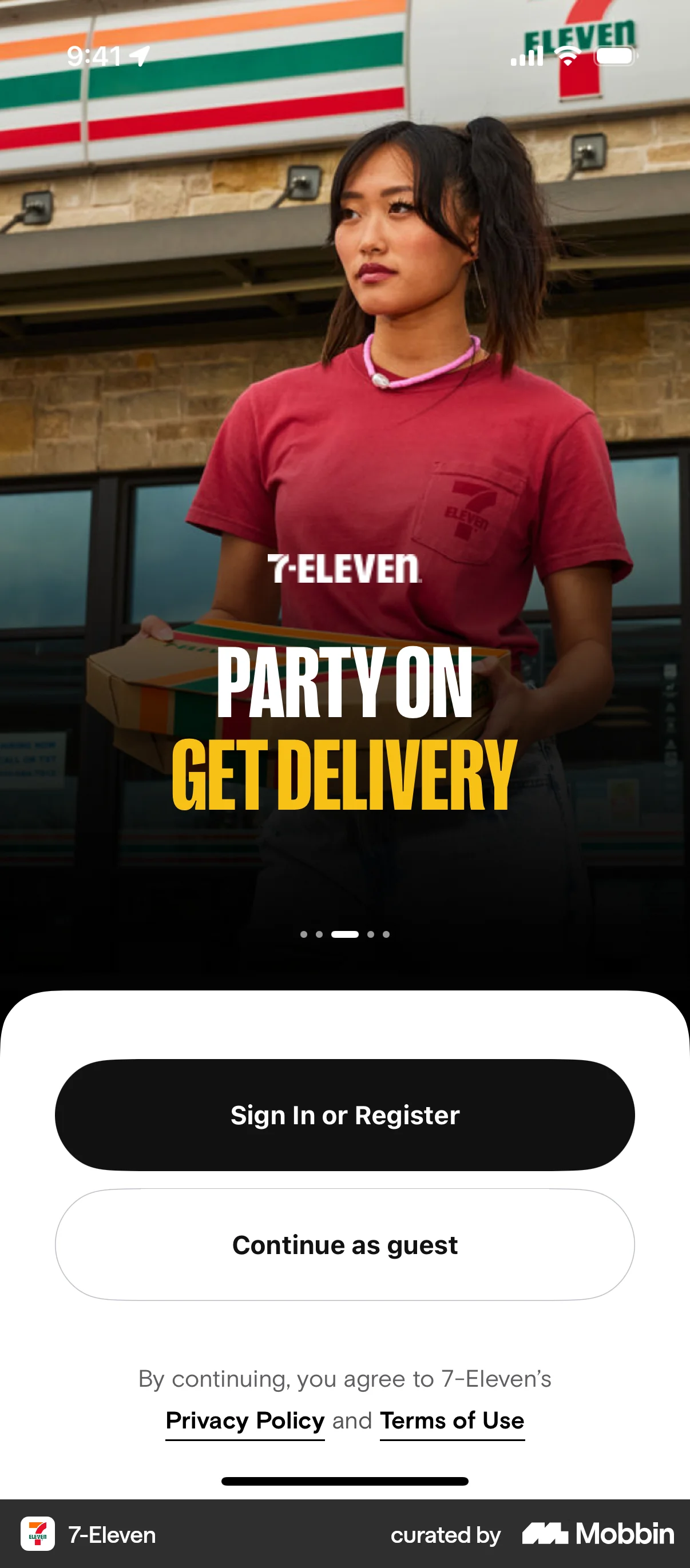
- Label the decline with what the user is choosing — “No thanks”, “Not now”, “Continue without an account” — never with a confession. The shamed decline is the most common instance of this pattern in the wild and the one with a named legal problem.
- Give the decline the same type size, hit area and contrast as the accept, both reachable without scrolling. In this design system that is one filled primary action and a real, legible secondary, not a greyed link under the fold.
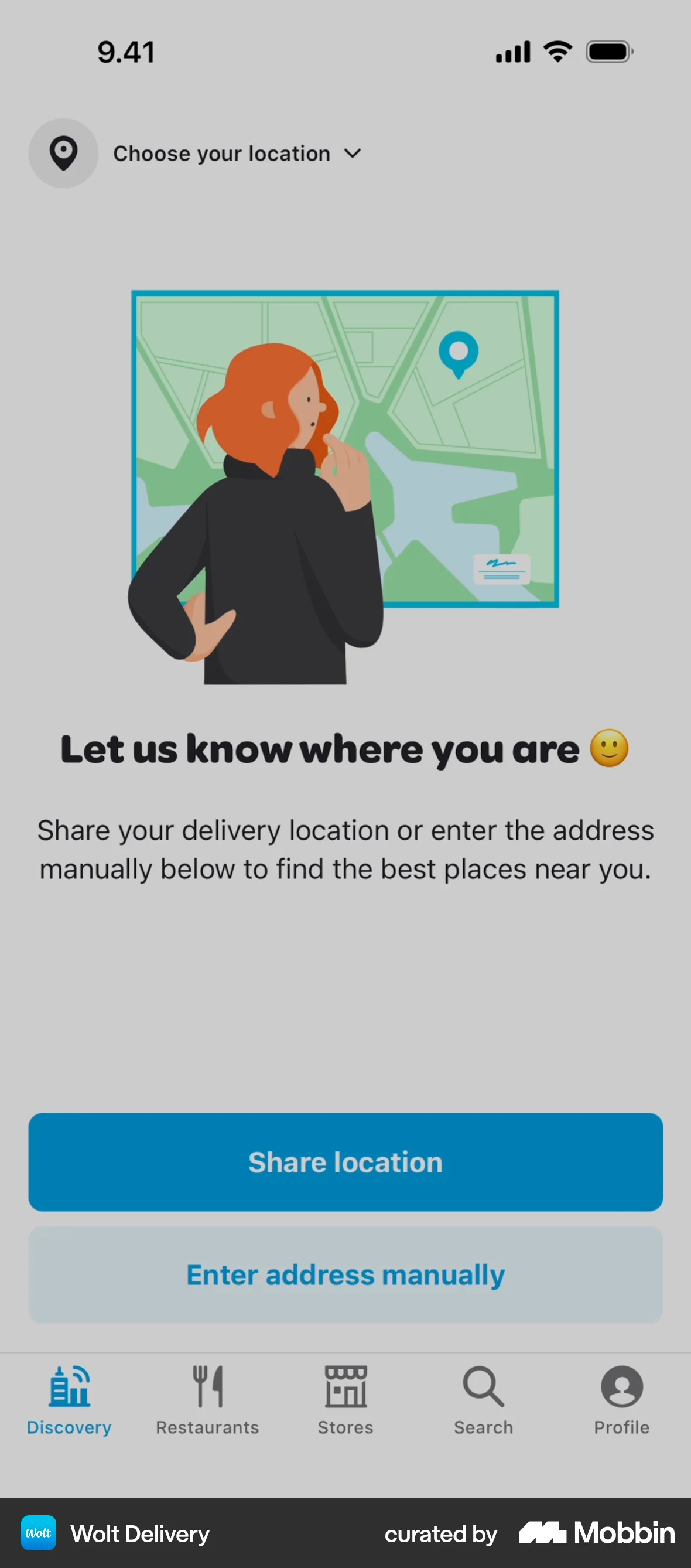
- Replace a single instruction with two or more real options wherever the ask is heavy. “Share your location” becomes “Use my location” and “Enter a city instead”.
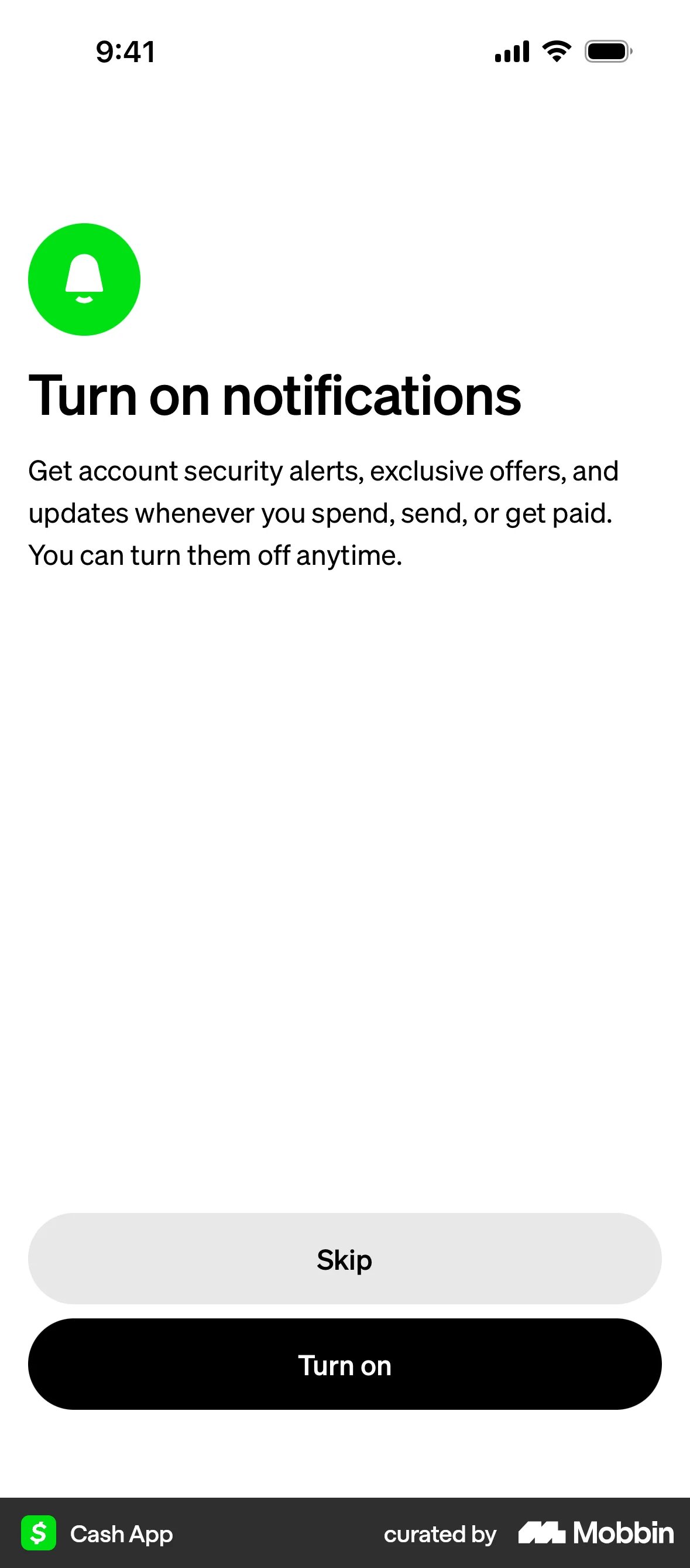
- Cap and remember dismissals: one prompt per decision, a decline that persists for a defined period, and a settings entry so the user can find it again. Repeated prompting after a choice has been made is named in Article 25(3)(b) of the Digital Services Act as a practice the Commission may issue guidelines on.
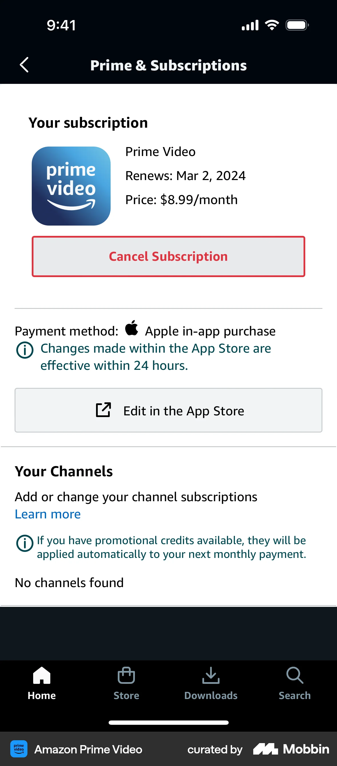
- Make withdrawing cost roughly the taps that granting cost — a consent toggle, a notification preference and a subscription all reversible from where they were set. Article 7(3) GDPR states that it shall be as easy to withdraw as to give consent, and ROSCA requires simple mechanisms to stop recurring charges.
- Put the privacy, personalization or sharing controls on the screen where the behaviour starts, not three levels deep. In Tucker's field experiment personalized ads went from no better than generic to nearly twice as effective once users had those controls, with no change to the targeting itself.
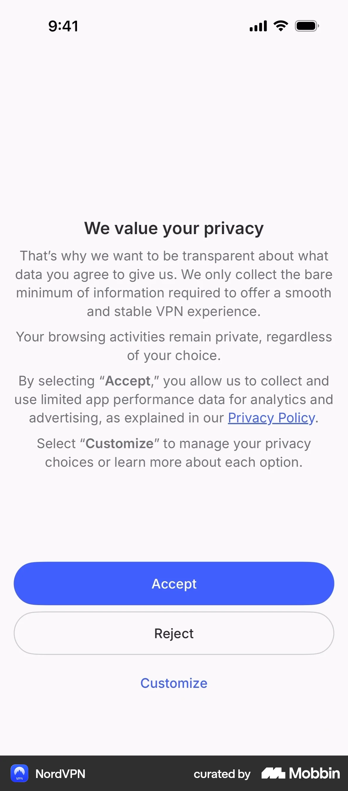
- Preselect the sensible option, label it as preselected, and show the alternative beside it. Disclosing a default did not measurably weaken it, and it removes the discovery that provokes the reaction.
- When a recommendation contradicts what the user picked, show the reason and the comparison next to their selection and leave the selection intact. Never auto-switch it: a contrary expert recommendation increased choice of the disparaged option while cutting satisfaction from 7.37 to 5.45.
What to avoid
- Confirmshaming copy of the “No thanks, I like paying full price” kind. The EDPB's Guidelines 03/2022, version 2.0, adopted 14 February 2023, name this as Emotional Steering — wording or visuals that convey information in a highly negative outlook, making users feel “anxious, guilty or punished” — and state that influencing decisions by providing biased information can generally be considered an unfair practice contrary to the fairness principle in Article 5(1)(a) GDPR. Do not keep it because it tests well; on the best available evidence it does test well.
- Nagging a user who has already said no. Article 25(1) of the Digital Services Act prohibits providers of online platforms from designing or operating interfaces in a way that deceives or manipulates recipients, or otherwise materially distorts or impairs their ability to make free and informed decisions, and Article 25(3)(b) names repeatedly requesting a choice the recipient has already made, especially via pop-ups that interfere with the experience.
- Burying the “reject” control to lift a consent rate. Nouwens and colleagues scraped the five most common consent platforms across the UK top 10,000 (n = 680) and found only 11.8% met minimal legal requirements; in their field experiment, removing the opt-out button from the first page raised consent by 22–23 percentage points, and adding granular controls to the first page lowered it by 8–20. The lift is a measure of the obstruction, not of consent.
- Blocking the product until a permission is granted, when the permission is not needed to deliver it. This is forced action rather than persuasion, and in a GDPR context Article 7(4) requires that utmost account be taken of whether a service is made conditional on consent to processing that is not necessary for it.
- Treating “our variant converted, so there was no reactance” as a result. In the only large controlled test of this on a real-looking interface, aggravation, felt freedom and dropout all moved in the aggressive condition while acceptance rose. Conversion is the metric least likely to show the cost.
- Auto-correcting a user's selection — swapping their plan, reordering their results, reverting a setting — in favour of what you recommend. That is the configuration that produced contrary choices and lower satisfaction in Fitzsimons and Lehmann.
- Overclaiming the remedy. “But you are free” and similar freedom-restoring postscripts have no effect across the low-bias studies, so shipping one does not license the pressure it is attached to.
Real-world examples
Measuring it
- Primary metric: completion of the whole flow, not acceptance at the step. Pressure moves the step and loses the flow — the aggressive condition produced 41.9% acceptance alongside 65 abandonments against 9 in the mild condition.
- Secondary: the quality of the yes. Reversal rate within 7 and 30 days, refunds, permission revocations, notification opt-outs and cancellations traced back to the prompt. A yes extracted under pressure is the yes most likely to be undone.
- Secondary: a short post-interaction measure of felt freedom and irritation on the variant, which is the construct itself. Dillard and Shen's threat-to-choice and anger items are the standard, and the Hong Psychological Reactance Scale gives you trait reactance to split results by — the subgroup that reacts hardest can be a minority large enough to carry your churn while the average looks flat.
- Backfire metric: contrary behaviour, not just non-compliance. Track whether users who saw the pushy variant are more likely to choose the opposite option, tighten privacy settings or downgrade — that is restoration, and it will not look like a conversion loss.
- Backfire metric: prompt fatigue. Count prompts shown per user per week, repeat prompts after a decline, and uninstall or unsubscribe rates in the week after. These are what Article 25(3)(b) of the DSA describes, and they are measurable before anyone complains.
References
- Rosenberg & Siegel (2018). A 50-Year Review of Psychological Reactance Theory: Do Not Read This Article. Motivation Science.
- Dillard & Shen (2005). On the Nature of Reactance and Its Role in Persuasive Health Communication. Communication Monographs.
- Rains (2013). The Nature of Psychological Reactance Revisited: A Meta-Analytic Review. Human Communication Research.
- Reynolds-Tylus (2019). Psychological Reactance and Persuasive Health Communication: A Review of the Literature. Frontiers in Communication.
- Shen (2015). Antecedents to Psychological Reactance: The Impact of Threat, Message Frame, and Choice. Health Communication.
- Fillon, Souchet, Pascual & Girandola (2023). The Effectiveness of the “But-You-Are-Free” Technique: Meta-Analysis and Re-Examination of the Technique. Meta-Psychology.
- Luguri & Strahilevitz (2021). Shining a Light on Dark Patterns. Journal of Legal Analysis.
- Mathur et al. (2019). Dark Patterns at Scale: Findings from a Crawl of 11K Shopping Websites. Proceedings of the ACM on Human-Computer Interaction.
- Fitzsimons & Lehmann (2004). Reactance to Recommendations: When Unsolicited Advice Yields Contrary Responses. Marketing Science.
- Tucker (2014). Social Networks, Personalized Advertising, and Privacy Controls. Journal of Marketing Research.
- Bruns, Kantorowicz-Reznichenko, Klement, Luistro Jonsson & Rahali (2018). Can Nudges Be Transparent and Yet Effective? Journal of Economic Psychology.
- Nouwens, Liccardi, Veale, Karger & Kagal (2020). Dark Patterns after the GDPR: Scraping Consent Pop-ups and Demonstrating Their Influence. CHI '20.
- Hong & Faedda (1996). Refinement of the Hong Psychological Reactance Scale. Educational and Psychological Measurement.
- EDPB (2023). Guidelines 03/2022 on Deceptive Design Patterns in Social Media Platform Interfaces, Version 2.0, adopted 14 February 2023.
- Regulation (EU) 2016/679 (GDPR), Article 7 — conditions for consent.
- Regulation (EU) 2022/2065 (Digital Services Act), Article 25 — online interface design and organisation.
- Restore Online Shoppers' Confidence Act, 15 U.S.C. § 8403.
For agents
An agent-friendly guide to this principle lives at /agents/reactance.md.
Our MCP server and skills for all principles are coming soon.
Similar principles
Disclaimer: The theories here are just that — theories. They may not apply universally and should be considered in context. Use your own judgment and consult additional sources when applying these principles.